Today is a cool overcast day here, the lake view is one of gray on gray reflecting the clouds in the waves and movement of the water. Some autumn color from this side and the far side of the lake is attractive and warm.
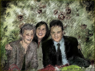
This image I am presenting today was made using CorelTRACE and CorelDRAW along with Paint.NET and Painter 8 with PhotoPaint as well.
This started as a photograph (taken by myself) of a trio who were at a wedding anniversary celebration. I opened the larger photograph in PhotoPaint and resized it for work on a web based image. Saving that file I opened it in CorelTRACE and turned it into a vector based image cmx format.
Using CorelDRAW I ungrouped the vector pieces and deleted some of the background to give me a white field to work with. I exported the vector - regrouped - to a jpg file format and using PhotoPaint I cleaned up some of the white field to be able to add to that background later in the process.
Saving that I opened it in Paint.NET to use the Effects> Artistic> Ink Sketch> filter on the image for line work. I then used PhotoPaint to mask the white field and inverted it filling it with the floral grunge background from Autumnights.
I opened that file in Painter 8 and Cloned it then using the clone I Auto Painted the whole piece with a Calligraphy pen for a painterly feel. Using the modified photo I had created I further changed the Auto Painted image to add back in details like the facial features and the floral and clothing detail. I used Charcoal brushes in differing sizes to add back the detail.
In PhotoPaint I used the Tint brush to add a bit of the green from the floral background to the trio to balance the colors out.
I added my signature and here is the finished piece.
----------------
Now playing on Windows Media Player: Kirk Mathew Gatzka - Basic Dirt - DADGAD
null

very cool image would look great framed Kirk
ReplyDeletehugz bev
Thank you, Bev! I have printed it out and it's darker than I had hoped. I am using 3rd party inks on my small Epson printer and I think this may have something to do with that. The blacks came out very saturated. It's only an 8.5"x11" on glossy photo paper and it looks fairly good. But too dark.
ReplyDeletethanks so much for the info on how you did this Kirk...looks stunning...wondered how you would lighten if it is too dark..
ReplyDeleteAvril
Thank you Avril! I think I could use my Tone Curves to lighten up the file but not certain that would desaturate the color altogether. Would not want to loos the color that is there. Im going to play around a bit but don't want to waste ink.
ReplyDeleteKirk
I like everything you do Kirk! You are always so creative! This is really a great trio!
ReplyDeleteThanks a lot!
Ciao, Giovanna
Thanks, Giovanna! I am happy you enjoyed the piece. I try!
ReplyDeleteKirk