Pages

Wednesday, June 29, 2011

Digital Art Academy Digital Collage in Painter Lesson 2


My second lesson Digital Collage piece is being shared today. Digital Art Academy's Journey in Collage is taking me places I have not yet gone in Corel Painter 11. I am enjoying the making of collages as I always have liked the process.

Learning new techniques is much fun, along with their own frustrations on doing them correctly. I am enjoying the lesson plan for working in Painter. I like learning new things!

I selected a number of pieces of Dover Clip Art for placing in this collage. And used some of the artwork supplied by DAA.

Listening --- dj matrix --- Castles in the Sky

Tuesday, June 28, 2011

Digital Art Academy - Digital Collage in Corel Painter - Lesson One


I'm taking a class at the Digital Art Academy on Digital Collage with Corel Painter. Here is the first lesson's results. I used a number of older photograph for the collage. Placing them at various levels and transparencies. I also used in the background three different fractal images that I blended and smoothed out.

I used an impasto brush for the texture of brushstrokes, but I won't share all of the techniques here. You'll have to take the class for the rest of them. So a shorter post for today.

Listening --- Ottmar Liebert --- Starry Night

Monday, June 27, 2011

Design for Life - Live to Design - Art Deco - CorelDRAW - PhotoPaint


A simple fairly clean designed image for today's Design for Life theme. It may have taken more time than it appears to have to create this piece.

I started out in CorelDRAW by acquiring and scanning in a cropped Art Deco floral motif from E. Benedictus' Art Deco Designs book. I added the text phrases after some thought. I wanted to encourage creative thought as I worked at each phrase.

I used the following fonts, not in any order of appearance: Twentieth Century Poster 1, Colonna MT, Banjoman Open Bold. I worked to fit them for a lively design.

After I chose and placed the type I selected all and grouped the objects and Converted to Bitmap. Then I copied to the clipboard and opened with PhotoPaint.

Here I browsed my Dover Clip Art and found the Megaphone Man whom I copied and pasted into the image. I used Replace Color on him and Multiply for transparency. I stood him balanced with one foot on the "L" in "Live," placing the large end of the megaphone at the center of the pink flower.

I had saved the large file and then resized the image for display. I did add a twenty pixel border to frame it.

Listening --- Creed --- What's This Life For?

Sunday, June 26, 2011

Art Deco - Design for Life Series - Digital Collage - CorelDRAW - PhotoPaint


For an Art Deco Design for Life image I chose two differing designs from E. Benedictus' Designs book. I opened CorelDRAW and acquired the first one cropping it in the Canon scanning software.

I rotated it 180 degrees to place it as I chose. Then I did the second design the same way. Placing them in close proximity. Then using Abadi MT Condensed typeface I added the Design for Life phrase, grouping them I duplicated and placed the duplicate upside down on the opposite side.

Next I grouped all the pieces and converted to bitmap, copied to the clipboard and pasted into PhotoPaint as a large file.

I then added the scanned images of the People at Work from North Light's book of the same name. I used the property Multiply for transparency and Color Replace for compatible colors. I placed the clip art and merged with the background. I placed a light blue twenty pixel wide border around the work.

I saved the large file and resampled for display here.

Listening --- The Beatles --- A Day in the Life

Saturday, June 25, 2011

More Design for Life - Art Nouveau - PhotoPaint - CorelDRAW


An Art Nouveau based collage for the Design for Life theme. I acquired a scan in PhotoPaint of two designs from R. Beauclair's book Art Nouveau Patterns and Designs. I cropped the first one to a large size and copied it to the clipboard and pasted it in CorelDRAW.

Using the freehand drawing tool I created a pink curve. I duplicated and shrunk it twice to add to the design placing them within one another. I used the font Yukon Gold for the text phrase.

Back in PhotoPaint I rotated the pattern and shrunk it down to a smaller size, copied and pasted that in CorelDRAW. Then in PhotoPaint I cropped a second piece of Art Nouveau pattern, copied and pasted that in CorelDRAW and duplicated it placing
a column down the right hand side.

I grouped all the pieces together and Converted to Bitmap and pasted it into PhotoPaint with New From Clipboard.

I wanted to add a bit of Victorian design to the corners so I selected a sample page from the Dover Clip Art folder and cut out the designs. I resized and placed them in the corners using the property Multiply for transparency.

I added a black border to the image to match the Victorian pieces and added my signature in black as well. I had adjusted the Tone Curve of the large image and saved it and then resampled for the web.

Listening --- Kirk Mathew Gatzka --- The Last Good Cowboy

Friday, June 24, 2011

Design for Life - Art Deco - Digital Collage - PhotoPaint - CorelDRAW


Another image in my Design for Life series. I used an Art Deco Design from Edouard Benedictus' book of designs. I scanned the image in and cropped it to the size I wanted. I acquired the image in PhotoPaint and cropped there.

I used the Tune Blur to smooth the Art Deco design, with the Directional Smooth. I browsed my Dover Clip Art folder for the Trees, and all three young people colored images.

With the trees I used Multiply to make the white backgrounds transparent. On the young people I used the wand to mask the white and inverted the mask and copied and pasted the images from the clipboard.

I scanned in the Dad and Daughter on the bike from North Light's clip art series People at Work book. I copied and pasted using the property of Multiply for transparency.

I then merged all the objects to one layer and copied that to the clipboard and opened CorelDRAW and pasted the image. I created a rectangle and filled it with tiled colored symbols. Then placed to back to create a frame around the Art Deco image.

I used the font Curlz MT for the Design for Life text and changed it's color to a bright yellow and placed it in the image.

I grouped all object together and converted to a bitmap and copied it to the clipboard. In PhotoPaint I pasted the large piece as New from clipboard. Using the Tone Curve once more I added some depth to the piece. To finalize it I added my signature, saved the large file and then resampled for the web and saved that file.

Listening --- Everclear --- I Will Buy You A New Life

Thursday, June 23, 2011

Design for Life - Art Deco - Digital Collage - PhotoPaint - CorelDRAW


Part of my Design for Life series I am sharing another Art Deco based image. Art Deco Designs by Edouard Benedictus is the source of the background design of this image. I scanned in the main background which looked jungle like. In PhotoPaint I cropped it.

Still in PhotoPaint I used the Tune Blur on it smoothing out the colors. Applying the Tone Curve for depth and increasing the saturation a bit for color.

I browsed my Dover clip art folder in Picasa 3 and selected the Lion, Rabbit, Butterflies and Birds. I opened each one individually, and used the Wand tool to select the white backgrounds, then inverted the mask and copied the color clip art to the clipboard. I then pasted and resized each according to need, placing them on the Art Deco background.

I copied the merged piece to the clipboard and opened CorelDRAW, pasted and added the frame. I used a gradient and selected the larger line size for completing the frame. I placed it to the back. I then placed the type Design for Life onto the gradient selecting the line color differing from the text color. I placed that type to the front.

I grouped the pieces all together and Converted to Bitmap and copied to the clipboard and reopened it (New from clipboard) in PhotoPaint to add my signature. I saved the large file first then resized for the web and saved the iteration.

Listening --- Bruce Cockburn --- Wondering Where the Lions Are

Wednesday, June 22, 2011

Puppeteer - Art Deco - Digital Collage - PhotoPaint


Art Deco Designs by Edouard Benedictus is the source of the background designs of this image. I scanned in the pieces as high resolution scans in PhotoPaint and applied the Tune Blur to smooth out the scans. I used the Tone Curve to boost colors.

I also opened with PhotoPaint a photograph of my Grandson and applied the Local Equalization tool then cut him out from the photograph and copied to the clipboard.

I pasted the large clip into the background after I applied feathering to smooth out the edges of the cutout. I used the Tone Curve again and also increased the color saturation by 15.

I scanned in the image of the teacher and little schoolboy from North Light's People at Work clip art series. I used Multiply for transparency and Color Replace for the pinkish color. I hand drew the strings attached to the teacher and schoolboy "puppet."

I used the font A bite for the word Puppeteer and selected a complimentary color and added the text.

In Filter Forge's frames I selected a photography frame for a 3D finishing touch.

Listening --- Archie Roach --- Beautiful Child

Tuesday, June 21, 2011

Goal 700 Posts Hit - Art Deco - Urgent - Design for Life


Art Deco is the basis for today's image. I scanned in a design plate from Stephen Calloway's Art Deco Interior and Panel Designs. I started with a very large image which I cropped in PhotoPaint.

I added the URGENT stamp, the stacked In Box, and the Woman Designer as well as the Hand Drawing with a Quill Pen from North Light's Spot Illustrations clip art book. Each one scanned in and then cropped and altered with the object property Multiply for transparency.

The URGENT stamp was black and white and I used the Color Replace tool to make it red. I also cut out the right side border design and added it to the left side by cut and paste to balance out the panel.

I added the text using the font 321Impact. I at first thought of the adage Design or Die but changed that to a positive note of Design for Life.

I boosted the colors with the Tone Curve and added a Filter Forge film frame.

A recent visit to Border's Bookstore and viewing of Art magazines has inspired me to do some of these colorful digital collages. Stampington's Somerset Digital Studio was full of impressive design collages that I really enjoyed reading about.

Listening --- Peter Frampton --- I'm In You

Monday, June 20, 2011

Creativity - Art Nouveau - Collage - PhotoPaint - CorelDRAW


Today's image began with a scan of an Art Nouveau pattern from R. Beauclair's large format book of patterns. I scanned it in as a large file and opened it in PhotoPaint, where I cropped the pattern I wanted. I used the Tune Blur Directional Blur to soften the image for the background.

I next scanned in the woman's thoughtful gaze piece from North Light's Spot Illustrations clip art book and placed it. I used the object (or layer) property of Multiply for transparency.

To add flavor I selected a Victorian Decorative Initial from a Dover clip art series book and scanned that in for the word Creativity. I added the phrase with another font in PhotoPaint.

I also chose another spot illustration from North Light, the hand and the stop watch to give a feeling of the racing thoughts of the creative process that I have when working on a new piece.

I then took the whole piece into CorelDRAW and added the color filled right hand border, filling the rectangles with sky and color. This added a more up to date feel to the piece. I used the black line to outline the image.

----------------
Now playing: Eric Clapton - Bell Bottom Blues
via FoxyTunes

Saturday, June 18, 2011

Duotone Dual 12-String Guitars - PhotoPaint


This Duotone is of combined images of my Seagull 12-String Guitar. One image was painted in Painter and the other is a photograph of the hummingbird etching with flowers I did freehand on the pickguard.

I truly enjoy this guitar and it's versatility. using my Woody Seymour Duncan soundhole pickup I connect it to my Toneport and the Gearbox software and emulated many differing guitar styles. From Archtop Jazz guitar to Hardcore Punk lead guitar styles it's a joy to play.

I had done the collage of the two images in Picasa 3 and resized in PhotoPaint for sharing here. I had previously painted the image on the left in Painter and cropped the photograph before I made the collage in Picasa 3.

I did the Duotone in PhotoPaint, selecting a color scheme that was pleasant to me. I loaded it from Corel's sets for such. I added a grunge frame in Filter Forge.

----------------
Now playing: The Who - Baba O'Riley [*]
via FoxyTunes

Friday, June 17, 2011

Superimposed Guitar Mashup - Grunge Guitars - PhotoPaint - Picasa 3


Here is a composite Acoustic Guitar image that began as a group of photographs collated in Picasa 3 as a superimposed collage. I selected all the photographs in a single folder and used the collage feature in Picasa 3 and applied the superimpose tool.

I reopened the image in PhotoPaint and resized it for the web. I then used my High Contrast workflow on it to give it the sharp color and line look and feel. I used Filter Forge's grunge frame on it for the finished piece.

Please review my other High Contrast image entries to read the techniques used to create this look.

----------------
Now playing: The Beatles - One After 909
via FoxyTunes

Thursday, June 16, 2011

Neighborhood Stroll - High Contrast - PhotoPaint - Filter Forge


A Neighborhood Stroll for the Grandparents, Parents and Grandson is the image for today. I cropped this photograph in PhotoPaint which shows us taking a walk with our Grandson near where he lives.

I used the Local Equalization tool for the High Contrast adding back in depth with the Tone Curve and upping the saturation for color. To add punch to the color I used Filter Forge's Photo Effects Vibrance, then a film frame.

It's great when your grandchild begins walking well enough that you can take a stroll with him. An easy family outing that goes at his pace and that is leisurely.

----------------
Now playing: Kirk Mathew Gatzka - I Walked Along the Lakes Song
via FoxyTunes

Wednesday, June 15, 2011

High Contrast Kitty - Linus Our Cat - PhotoPaint


A change in subject matter, but still using High Contrast techniques. I took an out of focus photograph of Linus our cat and put it through my high contrast workflow, after sharpening it as much as possible. I used PhotoPaint to sharpen the photograph and then applied the workflow I have discussed here previously.

I used Filter Forge's film frame for a finishing touch. Linus has been a fairly good cat for us. With the usual kitty stuff that comes with the territory. Which is frustrating to clean up. Spring and Fall he, being a longer haired cat, sheds profusely. He is a Maine Coon halfbreed of some sort. We don't know the other type of parent he had but one must have been the Maine Coon as he has the five toes and the fur and coloring.

Recently we had friends over and two of them were young girls ages 11 and 14. They loved him and he got more than the usual attention. Afterward he expected the same from us, poor guy, he did not get that much attention from us. But he did not pout. Cats own us, we don't own cats.


----------------
Now playing: Kirk Mathew Gatzka - Cats In The Cradle Cover
via FoxyTunes

Tuesday, June 14, 2011

Yellow - Color Burnt Guitars - Mayang's Textures - Dover Clip Art - PhotoPaint


Guitars have been the motif theme for a few days as I have done some Digital Collage work. I selected some guitar photographs and used Paint.NET's Ink Sketch filter for the largest photograph. Plucking a texture from Mayang's Textures, a yellow scratched metal plate, for the background, in Picasa 3.

In PhotoPaint I applied the guitars with the object property Color Burn for a rusty burnt look. I found a double piece of music from Dover Publications to add the notes and titles to the image.

I used the Tone Curve for some depth and upped the saturation by 15, one of my usual techniques for digital collage and other images. I applied Filter Forge's halftone frame in brown to complete the piece.

----------------
Now playing: Alan Parsons Project - What Goes Up
via FoxyTunes

Sunday, June 12, 2011

Grunge Guitars - Mayang's Textures - Paint.NET - PhotoPaint


Texture, line art, paint splatters, lyric snippet, chord progression all put together in a Digital Collage. I selected a guitar photograph and one of Mayang's Textures as the basis for this grunge guitar piece.

I opened the guitar photograph and applied the Ink Sketch tool to it for a line art appearance in Paint.NET. I selected all and copied to the clipboard. In PhotoPaint I opened a texture and pasted the guitar black and white image to it. I resized that to fit and cropped the image. I applied the object property of Color Burn to the Guitars and music stand and merged that with the texture.

I then applied the Tone Curve for depth and increased the saturation by 15 for a color boost. I opened a snippet of lyric in Notepad and copied it to the clipboard and proceeded to paste it as text into the image. I used the angle tool on the text object to line it up with the music stand and added paint drippings with Effects> Distort> Wet> Paint>.

A set of chords from another Notepad file and paint splatters added rounded out the piece. The chords do not fit the lyric snippet, they are only representing what a songwriter may use for a song.

----------------
Now playing: Kirk Mathew Gatzka - Art for Arts Sake
via FoxyTunes

Saturday, June 11, 2011

High Contrast Family Images - PhotoPaint - Filter Forge


A short post today of some High Contrast images of my family. I used my usual workflow for high contrasting images on these photographs. Two of them were taken at my Daughter's place and the other at our home. I used PhotoPaint and Filter Forge's Freepacks in creating these images.

I like the depth of these enhanced photographs and the use of the Filter Forge film frames give them some character they would not otherwise have. These photographs were taken in late April of this year during a visit from family from out of state.

----------------
Now playing: Kirk Mathew Gatzka - Evening Jam DADGAD
via FoxyTunes

Thursday, June 9, 2011

Digital Collage - Writing Machines - Dover Clip Art - Mayang's Textures


With the use of Dover Publications Clip Art and Mayang's Textures I created this digital collage, "Writing Machines." I selected in Picasa 3 a fossilized coral texture from my Mayang's Texture folder for the background. I opened it in PhotoPaint, I cropped this to a workable size and allowed the coral to show through. I then browsed my Dover folder for a Victorian corner embellishment and a round floral for some color with another Victorian clip art piece for an addition to the old fashioned theme.

I used the Tone Curve for depth and upped the saturation to boost the colors. I added the title into the collage using Courier New like a typewriter which I bolded then used the Effects> Distort> Plastic> on the words for a 3D appearance.

I have been re-reading Ted Nelson's book "Computer Lib / Dream Machines," where he coined the terms "hypertext," and "hypermedia," long before personal computers and the Internet as we know it existed. I have a copy of the 1987 Revised edition. The first edition came out in 1974 just before the Altair computer was invented. As I have been reading it this page of advertisements for the old fashioned writing machines peaked my imagination. for a subject for collage. Thus today's image was created.

The book is now a collectors item as it is out of print.

----------------
Now playing: Evis Costello - Every Day I Write The Book
via FoxyTunes

Wednesday, June 8, 2011

Colasanti's Landscape - PhotoPaint - Filter Forge


A photograph of Colasanti's Picnic Area with geese and bridge, complete with picnic table is today's subject. I had taken many differing photographs of our visit to Colasanti's from about a year ago and browsing in Picasa 3 I ran across this one. I like the stone walls and the bridge as well as the setting.

I opened with PhotoPaint and went for that vibrant deep image look and feel. Using Local Equalization and the Tone Curve for depth, I upped the saturation by 15, I also added vibrancy with Filter Forge's Photo Effects. I have found this process produces some HDR like photographs, which is nice as I don't use Photoshop or Lightroom for doing my digital visual art.

So we have a landscape for today instead of the grunge guitar motif I have been sharing lately. A nice break in the flow.

----------------
Now playing: Cat Stevens - Morning Has Broken
via FoxyTunes

Tuesday, June 7, 2011

Little Ink Pot's Thredgeholder - Guitars - Chords - Lyrics - Mayang's Textures


Continuing with a grunge guitar textured motif I selected a photograph of a rack of guitars in Picasa 3. I cropped that and selected a texture from my Mayang's Texture folder and cropped that as well.

In PhotoPaint I took the guitars and applied Little Ink Pot's Thredgeholder for a sketchy look and feel for the guitars. I layered that on the texture. Merged, I used the Tone Curve for some depth and increased the color saturation by 15.

I added a snippet of lyrics, some paint splatters and some guitar chords to balance the image, and keep it in the grungy look and feel.

----------------
Now playing: Mad Season - All Alone
via FoxyTunes

Monday, June 6, 2011

Chord Progression - Grunge Guitars - Paint Splatters


A cropped guitar photograph turned into an Ink Sketch and placed upon a texture from Mayang's Textures is the image for today.

I used Paint.NET to make the Ink Sketch of the guitars and to crop it I layered it upon the texture in PhotoPaint. I added a chord progression in black for anyone to tryout. Also a piece of a song, "I'm in a Box," was placed on an angle. I also placed some paint splatters for that grunge look and feel.

Using Filter Forge's Photo Effects Lumo I selected a variation which at once brightened some colors and muted others as well as added a frame.

----------------
Now playing: Kirk Mathew Gatzka - In A Box
via FoxyTunes

Sunday, June 5, 2011

Grunge Guitars - Gaussian Blur - Paint.NET -PhotoPaint


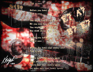
A return to a grunge guitar motif for today's image. I opened my Picasa 3 folder of Flaming Pear texture tiles and using the Collage feature created a collage of some of them. I selected the resulting collage and resampled it for a working size. I opened with PhotoPaint and applied the Tune Blur Gaussian blur to the textures. Then I made then into a Tritone and converted it back to RGB. I applied the Local Equalization to that for a high contrast background image.

I browsed to one of my guitar photograph folders and selected one of two guitars on an angle. I opened with Paint.NET and used the Effects> Artistic> Ink Sketch> tool with the color turned down and the ink up a bit. I resized that to a size similar to the background I had in PhotoPaint. I copied it to the clipboard and pasted it on top of the tritone background. I sized to fit. I used Filter Forge's frames for a film frame.

I added some dripping paint splashes and the text to a fun, bluesy lyric entitled "Talk It Over." I added the basic blues chords E7 - A7 and B7 to the image as well. Here is the lyric:

Before you hand your money over
Talk it over

Before you hand your money over
Talk it over

You might find a good deal
Or you may buy a lemon
You might find a good deal
But think about it hey man

Before you hand your money over
Talk it over

Before you hand your money over
Talk it over

Watch how your dollars spent
They gotta go as far as can be
Watch how your dollars spent
An make sure your honey agrees

If you don't watch your money
Someone else will be

If you don't watch your money, honey,
Someone else will be

Before you hand your money over
Talk it over

Before you hand your money over
Talk it over

It's OK to laugh at the lyrics, they are meant to be fun! As any married couple may know it takes two to make a budget and stick to it! So before that purchase, talk it over, can you really afford it? I hope you can.

----------------
Now playing: Kirk Mathew Gatzka - Talk It Over
via FoxyTunes

Thursday, June 2, 2011

Time in the Sand - High Contrast - PhotoPaint - Filter Forge


As you know I really enjoy time with my Grandson. We spent some time taking a walk around to the Park near his home. There he had some fun in the sand filling both hands with it and sifting it, watching it very carefully. His attention to detail constantly amazes me for such a young age.

I browsed to this photograph in Picasa 3 and opened with PhotoPaint. I used my High Contrast workflow on it for today's image. I had cropped the photograph, which has one flaw in that I just barely got the top of his head in the frame. So I cropped to a tight fit for his sitting there in his new sandals.

I also used Filter Forge's Photo Effects Vibrance for a boost to the colors as well as the Tone Curve in PhotoPaint for depth.

----------------
Now playing: Crosby, Stills, Nash and Young - Teach Your Children
via FoxyTunes

Wednesday, June 1, 2011

The Gift - Mayang's Textures - Dover Clip Art - PhotoPaint - Filter Forge


I browsed my Mayang's Textures in Picasa 3 and selected this textured glass piece. I opened in PhotoPaint and cropped the image a bit. Then I selected some Dover Publications Clip Art from Picasa 3's Dover folder.

Two images of old time transportation and a maiden tying a bow on a gift. I also selected a border piece which I replicated and lined the top of the image. After I had placed the individual pieces I applied the Local Equalization for some contrast and It left the maiden's skirt appearing as if the Sun were shining through the glass. I used the Tone Curve for some depth and a boost to the color was added using Filter Forge's Photo Effects Lumo.

This gave me a saturated image. I also applied KPT's Collection Lens Flare for a flaring where the Sun appeared to be shining through.

----------------
Now playing: Avril Lavigne - Fall To Pieces
via FoxyTunes