Pages

Showing posts with label buildings. Show all posts

Monday, April 15, 2013

"Of Tower and Arches II" High Contrast - Corel - Plus

Of Tower and Arches II


"Of Tower and Arches II," is a High Contrast version of my photograph of this amazing Park Warehouse. I used my Canon Rebel XTI to take this shot at the Park. I opened from Picasa 3.9 with Corel PhotoPaint, rotating the image to portrait.

I then applied the Local Equalization to it for the High Contrasts I wanted. I also used the Tone Curve tool to add depth to the image. Using the Filter Forge's Photo Effects plugin I applied Vibrancy to the image. I saved that large iteration.

I opened it with Corel PSP Pro X3 and used the Smart Photo Fix feature. I again increased the color and then applied the Saturation Vibrancy for more punch. I added in the EXIF information my title, the artist and copyright to it. I saved the full file.

I added my name and copyright to the image using the Text tool in PSP Pro X3. The last PNG of my signature created jagged edges on it so I have to attempt to make a transparent signature file again.

I resized the image here for display.

Sunday, April 14, 2013

"Old Brick Building Behind the Tower" Corel - Plus

Old Brick Building Behind the Tower


The image for my selection today was another photograph of the Tower and the building attached to the back. I took the photograph with my Canon Rebel XTI on the standard settings. I am not as adventurous as my son just yet in my photography.

From Picasa 3.9 I opened with Corel PSP Pro X3 and used the Smart Photo Fix feature. I increased some color and sharpness. I used the Saturation Vibrancy set at 33 on it. Doing these steps made the gray brick somewhat greenish in cast. I saved this large iteration.

I opened from Picasa with Corel PhotoPaint and cloned out an electrical cable. I applied Filter Forges' Photo Effects Vibrancy for a lighter image. Some of the greenish cast was adjusted by this step.

I used the Tone Curve to add depth and some punch to the overall color of the image. Now not as greenish but back to gray brick with shadows. I added my signature in black and resampled for display size in PhotoPaint.

I used PSP Pro X3 to adjust the EXIF data, including my copyright and title of the photograph. I saved it again for display.

Wednesday, April 10, 2013

"Of Broken Glass, Red Rafters and Arches" Corel PSP Pro X3

Of Broken Glass, Red Rafters and Arches
©2013 Keir M. Gatzka


"Of Broken Glass, Red Rafters and Arches" Corel PSP Pro X3

I am presenting another photograph taken by my son Keir M. Gatzka. The previous Tower and Arches photograph and processing, done by myself are somewhat duplicated here.

Keir took this photograph with our Canon Rebel XTI with settings on Manual. His focal point and angle is very creative here. I did only some basic adjustments on the original (see yesterday's blog entry.)

I think the two of us make a good team, and really enjoy sharing outings with him. We will probably make more visits to this Park as the season warms up and the foliage grows.

We live in an area near Metro Detroit, Michigan and have access to rural and urban subjects.

Today I spent some time working on a brochure for his Massage Therapy business: KMG Therapeutic. It came together late in the day so my post today is later than I would have liked.

He is an excellent Therapist and is striving to build clientele in Oakland County, Michigan. He does all forms of massage including Corporate Chair Massage. His website is at:

http://kmg-therapeutic.massagetherapy.com

email: keirgatzka@massagetherapy.com

Time to post and get on to the next step in my day Google+ streaming.

Tuesday, April 9, 2013

"Of Tower and Arches" Corel - Plus

Of Tower and Arches


"Of Tower and Arches," another photograph taken by my son Keir M. Gatzka. This was taken on April 1st, 2013. Using our Canon Rebel XTI in Manual focus, he set the focal point to the right hand side with depth of field more noticeable on the left.

I did my workflow in Corel PSP Pro X3 - Noise Removal, Smart Photo Fix, upped the color, Saturation Vibrancy set at 35. I added a KPT Collections LensFlare for the "sunlight" in the sky through the clouds.

I added full credit to Keir for this photograph, though I did the digital processing. I added his copyright and name using the Text feature of PSP Pro X3, and re-sized for display there as well.

As you can see this is a incredible old building with it's arches and tower. If it could only talk, the stories it would tell!


Sunday, April 7, 2013

"The Tower From Behind" Corel - Plus

The Tower From Behind


"The Tower From Behind," is today's photographic image. From our trip to the Park where we took numerous photographs of this fascinating old building, now a warehouse, I took this shot with my Canon Rebel XTI DSLR. 

I opened it from Picasa 3.9 as is my habit and used Corel PSP Pro X3 to adjust the image. I used my usual workflow steps, the Digital Camera Noise Removal and Smart Photo Fix. I increased the sharpness and the color in Photo Fix. I then further increased the Vibrancy in the Saturation tool set at 50.

I saved the large iteration and opened with Corel PhotoPaint. There were some electric cables strung to the building. Using the Cloning tool I cloned them out of the image. I added my signature and saved that large iteration.

I re-opened in PSP Pro X3 and added the Title and Artist, copyright information with Image Information feature. When I zoomed in I could see my cloning and am not truly satisfied with it. But I am allowing myself some leeway there as I am making the display version smaller. I adjusted to display size in PSP Pro X3 and saved it.

Saturday, April 6, 2013

"Brick Building - Broken Windows in Peak" Corel - Plus

Brick Building - Broken Windows in Peak


An additional Broken Window photograph from our trip to the Park. I opened from Picasa 3.9 with Corel PSP Pro X3. I applied the Digital Camera Noise Removal and the Smart Photo Fix features. I attempted to straighten the photograph but it cut off the Peak of the roof and so I discarded that tool.

I saved that large iteration. from Picasa I opened with Corel PhotoPaint. From PhotoPaint I selected the Fill tool and it's tile fill Load. I found a sky and cloud image and selected that for the fill tool at full size. Back with the photograph I selected the Wand tool and masked the white cloud filled sky. I used the fill tool now to add the Blue and partly cloudy sky. Then I removed the mask.

I then used Filter Forge's Photo Effects Vibrance on the image to give depth to the colors. I added my signature and resampled to display size after I saved the larger file.

After I saved the medium sized image I used KPT Collection's Projector to straighten the photograph just a bit. As It was take from the Ground Looking up I thought it was a bit off.

I used my Canon Rebel XTI DSLR for the original photograph, each photograph I took I'll take credit for and give credit to my son Keir M. Gatzka when he is the photographer.

After processing the photographs I'll add a my signature with the copyright date, as I am doing all the processing myself.

Wednesday, April 3, 2013

"Warehouse with Broken Glass Window" Corel - Plus

Warehouse with Broken Glass Window


It is sunny but cold yet here in South East Michigan, but spring is upon us. My son Keir M. Gatzka and I took a trip to a local park on Monday and took photographs of an old nostalgic building there. It has a wonderful tower and arches and differing color brick.

I took this photograph of the back of the building  It shows the bricks, boarded up windows and the top window with the broken glass.

I opened this with Corel PhotoPaint from Picasa 3.9 and applied the Local Equalization tool for high contrast. I also used the Tone Curve tool for some depth to the colors. I saved that iteration.

I opened it with Corel PSP Pro X3 applying the Digital Camera Noise Removal to it and it took out some of the graininess. To punch up the colors I used the Saturation Vibrancy feature on it set at 33 percent. I also used the Barrel Distortion tool set on High for the slight distortion of the Canon Rebel XTI lens. I added a Black Gradient frame to the image and saved again.

I re-sized for display and Increased the Color Depth and saved that iteration. Back in PhotoPaint I added my inverted signature and saved again.


Wednesday, December 14, 2011

"Venice" An Exercise in Painting with Painter 11

Venice


I have this book about "How to Paint Buildings" by Manel Plana Sicilia and Muntsa Calbo Angrill, that I've had for years. Today I decided to make an attempt to paint using Corel's Painter 11 from it. I found a print of one of the book's paintings and did my best to imitate it. I used Gouache Painter 11 brushes and a Wet Grain Blender brush, along with an Liquid Ink brush for color and line.

It was an interesting endeavor as digital painting is undoable if you make any mistakes. I finished the large painting and saved it opening with PhotoPaint. There I added my signature and applied the Tone Curve to boost color depth. I saved that iteration and opened it with Corel's PSP Pro X3 and using the frames they have in that program I added a mat and golden frame. Saving again I then resized the image for display here.

Listening --- Counting Crows --- Perfect Blue Buildings

Sunday, November 6, 2011

"Series 66 #4" Digital Collage - Corel PhotoPaint

Series 66 #4

"Series 66 #4," is one more Digital Collage of facial features and a few added things. I used Corel PhotoPaint, Corel PSP Pro X3, CorelDRAW, and Corel Painter 11 to create this collage.

I used cut and paste and erase and place for the image. I used various sources scanned in with my Canon MP495. I started with the background of some painted buildings and opened that in Painter 11 where I used Motion Blur and Apply Surface Texture Image Luminance on it. Back in PhotoPaint I added the various scanned pieces to create the face.

I also used a DaVinci drawing of hands and placed them playing a guitar. I had used Little Ink Pot's Thredgeholder on the guitar for it's sketchiness. Each piece was scanned in, I applied the Tone Curve for color depth, and Tune blur to smooth out each one. Then they would stand out from the textural background.

I used CorelDRAW for the numbers "66" and "#4" using purple as a compliment of the orange shades of the background. These I copied and pasted, sizing to fit the larger image.

I resampled the image to display and share along with adding my signature, finishing up in PhotoPaint.

Not listening to any music at the time I created this, created in quiet for a change.

Tuesday, May 3, 2011

More Luminous Landscapes - PhotoPaint - Filter Forge's Freepacks


This derelict barn coop was one of the photographs I received recently taken by a relative. I scanned the photograph in at 300 dpi, and opened it with PhotoPaint.

In PhotoPaint I applied Tune Blur directional smooth to soften the image. I then upped the saturation for the color boost to the image.

In Filter Forge's Photo Effects I used Vibrance for additional punch to the piece. Then I added a Filter Forge film frame to it. Saving that file, I resampled for display here.

I applied the same basic techniques to the second, barely there barn image, for similar results.

These photographs are both intriguing and great to work with. I thoroughly enjoyed creating a look and feel for them. I have a few more to share next post.

----------------
Now playing: Henry Mancini - Peter Gunn
via FoxyTunes

Tuesday, January 18, 2011

Robison Hardware Building - Paint.NET - PhotoPaint


Continuing with a building motif I browsed in Picasa 3 and did a search on "buildings" and came up with this photograph. Taken by my son Keir M. Gatzka, I believe in Toledo, Ohio. "Rolison Hardware," was established in 1914, but this location was built in 1923.

I used Paint.NET and applied the Ink Sketch filter with color full up and the ink reduced. I saved the file and opened in PhotoPaint where I resized it for the web. Did some cleaning up of the white sky, selected it with the wand and filled it with a sunset fill.

I used the Tone Curve for depth and increased the saturation by 7. I added a brick brown border of about 50 pixels. I selected this with the wand, and applied the 3D Bevel effect. With the mask still in place I applied the Effects> Texture> Plastic> filter to the frame, using the brick red color again.

----------------
Now playing: Blue Edge of the Prairie - My Misery
via FoxyTunes

Sunday, December 19, 2010

Old Building - Toledo Ohio - Art Nouveau


I began today's image as a large collage made in Picasa 3. There I used the collage aspect of super-
imposing photo-
graph upon photograph to create a background.

I opened PhotoPaint and using Picasa selected an older building photograph taken by my son Keir M. Gatzka in downtown Toledo, Ohio. I copied it to the clipboard and pasted it into the background.

In Paint.NET I turned the same building into an pen and ink image which I copied and pasted over the existing gray-scaled buildings image, using the object property Multiply to allow the background to show through.

In PhotoPaint I went to my Dover Publications clip art folder and selected an advertisement that I reshaped and resized to place on the side of the building. I used object property Opacity to alter the transparency of the advertisement to allow the brick work and cement work to show through.

I also selected another advertisement for the center block of the front of the building. which I sized and reshaped to fit. Also altering the opacity of it to add slight color to the building's heading. I added a stained glass window to one of the windows of the building.

I took an Art Nouveau frame which was portrait in size and made it a rectangle to fit the image for framing it. I altered the color to match the building's color.

I then added the Art Nouveau woman and cut her out while in PhotoPaint and pasted her into the image. I used the eraser to clean her up and applied object feathering to her, sizing her to the window to give the appearance of her reaching out. Then placed her with the Ctrl-Shift-Down Arrow.

I upped the saturation of the picture a bit for boosting the color and used the Tone Curve to give it some depth.

----------------
Now playing: The Beatles - Hard Days Night
via FoxyTunes

Tuesday, September 28, 2010

Vector Graphics - Experiment with Bitmapped Graphics


I love to experi-
ment with bit-
mapped images using vector tools on them for unusual results. This photograph of a close up of sunglasses and reflection, with nose, was taken by my son, Keir M. Gatzka a few summers ago. As you can see it captured my imagination and I used it for an experiment.

I first opened the photograph in Paint.NET and adjusted the size, and used the Ink Sketch filter on it with no color for the black and white image as the basis of this experiment. Then I opened it in Painter 8 and added a watercolor layer and used a large watercolor brush with two colors only for the background.

I copied the image to the clipboard and opened CorelDRAW, pasted it and began to add some vector graphics. I used the Freehand drawing tool and created some bits and pieces of paisley and florals plus some swirled lines. I also built some buildings and a car with a road.

I copied that to the clipboard and pasted it as a new image in PhotoPaint. I added a 20 pixel border and signed it. I made the image a jpg file for display here.

----------------
Now playing: Kirk Mathew Gatzka - Eleanor Rigby Cover
via FoxyTunes

Wednesday, September 22, 2010

Back to Digital Painting - Colorful House - Painter 8 Wow! Book Brushes


Visiting my grandson Zeke yesterday and my daughter showed me a photograph that begged to be painted digitally. I asked for a copy and she sent one to me.

In PhotoPaint I resampled the image to 880, plus 128dpi. I added a blue sky to the picture as it was white, and I included a few clouds. I used this image in Painter 8 to digitally paint. I used the Painter 8 Wow! Book's Building brushes Feather brush at varying sizes as my brush of choice. I kept it at 5.9 size for detailed appearance, with the exception of increasing it for the sky.

I used Apply Surface Texture> Image Luminance> to add texture to the brushstrokes. I saved that file at optimum resolution. Reopened it in PhotoPaint and added a painting frame to it with Filter Forge's Frames. I then used the Tone Curve for depth and upped the saturation by 7 for brighter color.

My daughter did not know the photographer of this house, so I would like to credit them here. If you recognize their work, please let me know who the photographer is that I may give full credit to them. Thank you.


----------------
Now playing: Kirk Mathew Gatzka - Our House Cover
via FoxyTunes

Thursday, September 9, 2010

Industrial Brick Building - Digital Collage - PhotoPaint


This image is a comb-
ination of multiple pieces. I used another background from Mayang's textures, a brick building with old broken windows from an industrial area. I selected some Art Nouveau stained glass pieces and added them to some of the windows. I also used some clipart for a couple more of the windows, all from Dover Pubilcations.

I used PhotoPaint for putting together this digital collage. I added some with the object property Multiply, others I resized them to fit the window size and pasted. The Parking sign I adjusted the opacity so some of the window would show through.

I cut out the woman lute player and pasted her after making the window appear to be open with some object adjustments to it, and placing a black to gray rectangle in her background.

I added the pasted poster Hello Beautiful with an opacity adjustment and pasted all the pieces in place, resizing as needed.

I used the Tone Curve to give the brick wall some depth and upped the saturation for the colors just a tad. I have left the piece at a larger size for your pleasure. The big picture as it were.

----------------
Now playing: Bo Diddely - Bo Diddely
via FoxyTunes

Tuesday, August 24, 2010

PolkaDots - Vector Graphics - Dover Clip Art


Shepherdess with polka dots and her creatures are todays focus. I again took some liberties with the design books and magazines I looked at and created an imaginary scene in vector graphics with the backgrounds from Dover Publications.

I used CorelDRAW, and PhotoPaint for the creation of this piece. I selected odd colors on purpose as well as odd creatures to shepherd. I added the polka dots at the end as the girl's shirt needed something extra.

Saturday, July 10, 2010

Art Deco Arch - Sky in Glass - Buildings


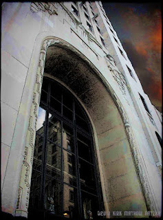
A quick trip to Toledo, Ohio [click here] for a day garnered a few photographs of structures there. The first one is an Art Deco Arch of a bank building. I opened it in Paint.NET and used the Effects> Artistic> Ink Sketch> filter. I saved that file and opened it in PhotoPaint where added the orange sky and I upped the saturation for color boost. I used the Tone Curve to add some depth.

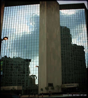
Other than photographs of family that was with me I only got a few photographs of structures. This next photograph I noticed some barreling of my lens which is not wide angle. So I had to compensate using KPT's Collection Projector. I adjusted it as best I could with still some slight upward gazing distortion. I liked the way the sky was reflected, as well as some surrounding buildings that were also.

I used similar adjustments to the photograph as the first one showing. I did not use the Ink Sketch on this one. I did all the work in PhotoPaint. Adjusting the barreling of the lens as well as my program's offered. I upped the saturation of colors and used the Tone Curve again for some depth. Both images are framed in Filter Forge with a slight film frame.

Musically I haven't had any time to do any songwriting but I have been viewing some videos of some musicians and still listening the the Bosnian Traditional music my friend Dragan has shared with me.

"A Day In Toledo" might make for a good title but I am not sure what to write yet. I find that at times my digital visual arts satisfy the craving for creativity and my music suffers.

I have received some suggestions on how to improve one of my songs which was written at the first snowfall last year about both the sun shining and the snow falling at the same time as I was look out over the lake.

I need to analyze the suggestions and see if they will in fact improve the song before I make any adjustments. I tend to like my songs from the first draft, which is the mark of a hobbyist and not a professional songwriter. Ah, at least I have an out let for creative endeavors!

Listening --- Jadranka Stojakovic feat. Miroslav Tadic - KAD JA PODJOH NA BENTBASU