Tuesday, November 30, 2010
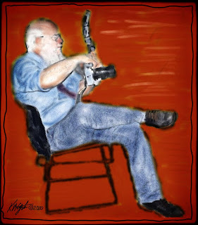
The Wedding Photographer - Steps to a Digital Watercolor
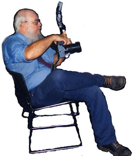
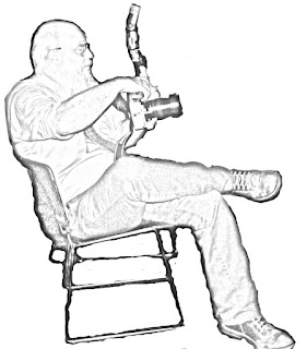
I began today's image with a photograph of a wedding photographer sitting down with his camera at the ready. I scanned in the image as 300dpi and opened it in PhotoPaint. There I cropped the image to focus on the photographer.
I used the eraser on white to roughly erase all the extraneous photograph and saved that picture as a file. I opened the file in Paint.NET to apply the Pencil Sketch filter to it. What I got was a nice sketch of him with a white background.
Saving that file I opened it next in Painter 8 and selected the Watercolor Brushes. I used a camel hair brush at varying sizes, and also for the background I used the Digital Watercolor brushes on the beginning layer.
I used two differing colors for the background an ocher and a red, brushing them around and horizontal to the seated photographer.
I reopened in PhotoPaint to create a border to the image and apply Filter Forge's Freepack 3 watercolor frame first. Then I applied a film frame to it as well. To finish it I drew a freehand black line around the image just inside of the outward most frame.
I have shared three images to give the general idea of how this piece progressed.
----------------
Now playing: Bob Dylan - Bob Dylan Three Tunes
via FoxyTunes
Labels:
creative,
digital painting,
filters,
frames,
lineart,
Paint.Net,
Painter 8,
pencil,
photograph,
PhotoPaint,
portrait,
visual art,
watercolor
Saturday, November 27, 2010
Playful Digital Collage - PhotoPaint - Paint.NET
A piece of Mayangs' Bubbled Paint / Rust Texture, Dover Publica-
tions Clip Art, a portrait in pen and ink, make up today's image. I enjoy digital collage very much and it is a satisfying creative act.
I choose Flora's Feast clip art by Walter Crane of a woman playing two flutes and dancing, Another piece was a chart of a man's body with proportions. A border design on the right hand side, which I narrowed and lengthened it before placing it. To this I added an pen and ink portrait to give a central focal point.
To create the portrait I used Paint.NET and the Effects> Artistic> Ink Sketch filter with the color set to it's lowest and also lowering the ink thickness. I cut the face out and pasted it as a new image to add it.
I did all the rest of this in PhotoPaint, and used Alien Skin's Exposure 3 vignette only Round Soft filter on the whole image. In Exposure I adjusted the saturation and tone curve for color and depth. Adding a finish of Filter Forge's Freepack 3 light film frame to the image.
----------------
Now playing: NPR - CMJ: Looking Back to a Whirlwind of Music
via FoxyTunes
Friday, November 26, 2010
Speaking Out - PostWorkShop DEMO - and Other Stories
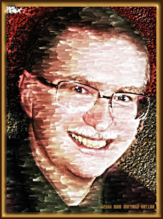
Today's image started out as a scanned in, 300dpi, photograph of a friend of mine. He is a good friend and is very outspoken thus the title, "Speaking Out." I used various steps to produce the final image.
I first applied a Gauguin filter from PostWorkShop's DEMO version [click here] which left me with a nice image but covered with watermarks announcing the DEMO. I liked the beginning piece so I did more digital work on it.
In PhotoPaint I copied the original photograph to the clipboard, and resized the DEMO output, I pasted the original into the Gauguin image. Using the object properties I adjusted the opacity to allow the paint like portion to show through but this effectively did away with the DEMO watermarks and I merged it. As the background was sufficiently white I used the magic wand selector and added a blue violet gradient to the background.
I had some white lines around the head and face so I selected the clone tool and used that around the outline getting rid of the white. Saving that file I reopened it in Painter.
While in Painter I used a Cort pen brush and drew around the main parts of the face and head and some details of the clothing. This gave the piece a pen and ink and painted look and feel.
Back in PhotoPaint I added a small black border to the image. Then I used Filter Forge's Freepack 3 to add a black film frame which darkened some of the background, which gave it a finished appearance. I then applied the Tone Curve for added depth to the piece.
As you can see the finished piece has a nice look and feel of traditional media.
----------------
Now playing: A.I.C. - Don't Follow
via FoxyTunes
Thursday, November 25, 2010
Digital Collage - Guitar Player - Picasa 3 - Vision Board - Flaming Pear - PhotoPaint
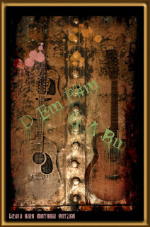
Here is another Digital Collage made with Picasa 3. I began work in the program Vision Board Builder and formed a collage of the "Guitar Player Chording D" and other guitar photographs.
I opened this file in Painter and used the Flaming Pear filters on it to create differing styles of the beginning collage. I saved each image separately and went back to Picasa 3 to select them for another collage. I created the collage and saved it. Then I opened it in PhotoPaint to add a film frame from Filter Forge's Freepack 3.
I did some curves using the Tone Curves in PhotoPaint to give depth to this collage. I inverted my signature file and added it in white to the finished collage.
----------------
Now playing: NPR - Bob Dylan Bootlegs, Tom Tom Club, Marah
via FoxyTunes
Tuesday, November 23, 2010
Narrow Overpass - Paint.NET - Painter - PhotoPaint
I wanted to take a look at some older film photo-
graphs from many years of family photo-
graphy so I pulled out the ones that didn't make it into an album.
I found a few that captured my interest and here is the Narrow Overpass photograph after I scanned it in and did some digital work on it.
First I used Paint.NET to make it painterly and then used the Ink Sketch filter on that. I brought that file into PhotoPaint and I masked and added a blue violet gradient sky, as the one in the photograph was overcast and white / gray. From there I took it into Painter and used a small oil brush to paint around the trees and the railing. During this process the power lines disappeared from the sky, not missing them I saved that file.
I added a film frame with Filter Forge's Freepack 3 and resampled for posting here.
----------------
Now playing: Dashboard Confessional - 1
via FoxyTunes
Monday, November 22, 2010
Inspiration Striking - Dual Guitars
Last night I was playing my 12-string guitar and striving to work with a chord progression that used G D C D Em Em7 Em6 Am Am7 Am/G Am/F# back to G. I was able to come up with a workable base with these chords but no melody or lyric came to mind.
Sometimes the inspiration is there striking like a bolt of lightning other times it takes time for it to burst into a full-blown song. I like impulse driven inspiration the best, but it doesn't always happen. Sweat Equity comes to play, hard work and time. I'm not very patient to be honest, and like it when a song bursts into being.
That wasn't happening last night. So I did today's image - two guitars in black and white with a lightning bolt added to the piece. I used Alien Skins Exposure 3 trial to make the color photograph a black and white one with a bit of a border created in PhotoPaint.
I had an image of a lightning bolt that I added, it was made using KPT's Collection feature. It was just an experiment that today came in handy to illustrate the type of Inspiration I really enjoy. Not that I don't mind a good challenge mind you, I do. I feel that some songs just happen and creating them is a joy. Others are a challenge and are not as much fun, but still it's enjoyable to overcome with a decent finished song.
A little Sweat Equity never hurts.
----------------
Now playing: Kirk Mathew Gatzka - I Want It Today
via FoxyTunes
Saturday, November 20, 2010
Painter Wow! Book Brushes - Watercolor - Chalk - Liquid Ink - Ezekiel in Hat
I really like this photo-
graph of my Grandson Zeke with his hat on crooked. So I decided to paint it digitally. I used the following:
Painter 8
Wow! Book brushes, acrylics, building brushes
Chalk
Liquid Ink
Watercolor (not necessarily in order of appearance.)
I was going for a new look and feel to doing portraits and I love the wide variety of brushes in Painter. I wanted a loose feel but striking colors and style. Chalk and Liquid Ink brushes lent to that effort.
I used PhotoPaint only to crop the photograph, and add borders to frame the piece. All the painting from the reference photograph was done in Painter.
In Painter I did a muck up with Watercolor brushes. Switched to the Wow! Book brushes and painted in details. Added color with the Chalk brushes and the Liquid Ink brushes.
I thoroughly enjoyed doing this piece.
----------------
Now playing: Bto - You Ain't Seen Nothing Yet
via FoxyTunes
Labels:
chalk,
color,
digital painting,
frame,
Painter 8,
pen and ink,
photograph,
PhotoPaint,
visual art,
watercolor
Thursday, November 18, 2010
Digital Collage Experiments - Vision Board Builder - PhotoPaint
I was enjoying a playful time with Vision Board Builder collage making software I introduced a post ago. I found it delightful to use along with Picasa 3 browsing my collection of images.
The first image has as a theme Stringed Instruments and I used some famous artworks along with photographs. I used a pixelization plugin on it and it slightly pixelized the image. I added a film frame to it in PhotoPaint using Filter Forge's Freepack 3.
The second image doesn't really have a theme except for the color red, which is found in most of the pieces with some exceptions. Red was my primary background color and I enhanced the image for that color. I also used a flim frame on this one.
As you can notice I joined Sound-
Cloud to post my music and place some of it on the blog with a player widget. My first song I uploaded and shared was "Collision Warning" a song about pride and it's downfalls.
I will add some more songs up to my free storage limit and share them here. I hope you enjoy them and ask for your comments as well as any you would like to make on the artwork.
----------------
Now playing: Buffalo Springfield - Smile on Your Brother
via FoxyTunes
Labels:
digital collage,
frames,
music,
PhotoPaint,
Picasa 3,
Vision Board Builder
Wednesday, November 17, 2010
More Digital Collage - Vision Board Builder - Picasa 3
I am still using my trial versions of the plugins I mentioned in yesterdays post. Doing digital collages in Picasa3 and a new free program from Day Blocks called Vision Board Builder [click here].
I am posting another two images today of this different approaches to collage. I selected multiple photographs of my Grandson for these. You might say the "Many Faces of Ezekiel," which I entitled one of them.
As you can see I used some of the same photographs for the second collage. Having a grandson is wonderful and one cna't help taking more and more photographs. I had a visit from them yesterday and got a few more of him with one of his hats on. An enjoyable visit and time well spent.
You'll notice the radial feature of Vision Board Builders collage with some lines showing through, but mostly the blending works very well.
I had no trouble with using it first time out. It opened without a hitch and the placement of the modified photographs was easily accomplished.
I should mention that Kurt, the programmer of Vision Board Builder also has a video explaining how to use the program for building your Vision boards or collages on his page that I have the link to above. Tim, an acquaintance on Painter Talk found the program and that's how I found out about it. So if you are interested in digital collage I recommend this program.
----------------
Now playing: Buffalo Springfield - Everybody Look What's Going Down
via FoxyTunes
Tuesday, November 16, 2010
Fun with Picasa 3 Collage - Alien Skin - Flaming Pear
I often use Picasa 3 for browsing and choosing photo-
graphs and / or artwork to work on digitally. I also like the Collage feature of it.
Yesterday I downloaded some trial versions of plugins for Painter and PhotoPaint. Two from Alien Skin [click here] and some freebies from Flaming Pear [click here].
I used Picasa 3 to browse and find photographs to experiment on using these plugins. The first shown is a collage of guitar photographs that I used various plugins on. Unfortunately I did not keep track of which ones I used, but as you can see I ended up with a dramatic collage.
The second collage is made up of eight differing experiments on the same portrait photograph. This is a crop of a photograph taken by my son Keir M. Gatzka. I do remember using Exposure 3 from Alien Skin for most of these differing exposures.
I used Picasa 3 to make a 16:9 collage of the eight faces using a grid with the image posted behind the faces and a drop shadow around each. All done with Picasa 3. I opened the large collage files in PhotoPaint to resample for viewing here, using a 1200 pixel width.
Both collages turned out as interesting studies and show the versatility of the plugins I am trying out. One interesting facet was inverting my signature file for the second image, making it white instead of black. I still have to experiment with replacing color on the signature for other images that need a different color. But in due time I will do that as well.
----------------
Now playing: Archie Roach - Life Is Worth Living
via FoxyTunes
Labels:
12-string Guitar,
6-string guitar,
digital collage,
Faces,
guitar,
Painter 8,
photograph,
PhotoPaint,
Picasa 3,
visual art
Monday, November 15, 2010
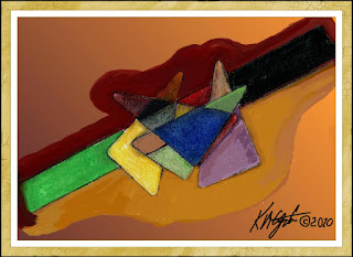
Driven to Abstraction - Traditional Tools - Painter 8
I was up last night and I decided to get out my tradi-
tional art tools and do an abstract piece. I used a drafting triangle for the lines and the center of it for the triangles with the curved corners.
I used a number of different Pencils, colored, watercolor, pastel, and soft pastels to do the coloring. I wanted to use intersecting lines and differing color to do this non-representational image. I kept it pretty simple.
Today I scanned in the image I created and used PhotoPaint to adjust the working size. There I selected the wand and masked out the forms while I added a brownish gradient to the background, that had been left white on the original.
Saving a interim file I opened it in Painter 8 and selected a flat blender brush and blended some of the colored areas starting with the edges. I wanted to leave some of the texture in so I did not blend every colored piece.
I saved this file and added, back in PhotoPaint, a border and a frame using Filter Forge's Freepack 3. I used my new digital signature file complete with hand drawn symbol and date.
All in all I had fun using traditional tools again and will try to do more sketching and abstractions as well as fictional portraits, in the future, to scan and use digital tools on them.
----------------
Now playing: Kirk Mathew Gatzka - Switch Time
via FoxyTunes
Labels:
abstracts,
color,
frame,
Painter 8,
PhotoPaint,
texture,
Traditional Tools,
visual art
Saturday, November 13, 2010
Friday, November 12, 2010
Thursday, November 11, 2010
Wednesday, November 10, 2010
Red Colored Produce - Paint.NET - PhotoPaint
My misad-
venture with Filter Forge's Free-
pack 3 has been solved. I had saved the install program for instances like I had yesterday when it quit working for me. So today I reinstalled it. But I had to fight with my Anti-virus program to allow it's installation. I successfully reinstalled it and used it on this image.
I applied the same techniques I used on yesterdays produce image. Using both Paint.NET and PhotoPaint I adjusted this photograph taken by my son Keir M. Gatzka. I made this piece very red and did so with the framing as well.
The depth of color using these techniques are extremely satisfying in a straight forward handling of an image presentation. As I am creating such images sometimes the steps I take are ones that I have successfully used before. I tend to remember these steps and use them again and again for differing pieces. Thus I have a series of images that look similar and are in a similar motif.
Like the use of a formula of Verse, Verse, Chorus, Verse, Bridge, Chorus, that a songwriter may use for the forming of a song, I use these steps to produce digital visual art.
----------------
Now playing: Ace of Base - The Sign
via FoxyTunes
Labels:
digital manipulation,
image,
lineart,
Paint.Net,
photograph,
PhotoPaint,
songwriting,
visual art
Tuesday, November 9, 2010
Colorfilled Produce Market - Paint.NET - PhotoPaint
Today I was working on an image and when I went to finish it off with a frame from Filter Forge's Freepack 3 the plugin would not open. I tried closing the program, after saving the image, and reopening it and it still did not work. So, I closed down some programs I had open to free up memory and it still did not work. Disappointed I created my own frame.
I had started with a photograph taken by my son, Keir M. Gatzka, in the Lansing, Michigan area of some produce in the market we were visiting.
I opened the photograph in Paint.NET and applied my favorite painterly filter to it. I resized the image to a working size for the internet. I then applied the Ink Sketch artistic feature to it pushing the color up all the way and reducing the ink lines to allow more color.
I used Curves> Luminosity> and gave the piece depth. I saved this file and opened it in PhotoPaint. Here I upped the saturation by 15 and tried to frame it. Since Filter Forge's frames did not work I created a black border about 90 pixels wide, then a yellow border with a 10 pixel wide black border.
I used the wand to select the yellow and applied Effects> Texture> Plastic> for a 3D look to the frame. I added my signature to the image and finished it. Saved it again for display here.
----------------
Now playing: Edward Sparks - Heartlandtest1182010
via FoxyTunes
Labels:
digital manipulation,
frames,
Paint.Net,
pen and ink,
photograph,
visual art
Monday, November 8, 2010
Screen Casting with CamStudio - Vector to Painting - Ink Sketch - Paint.NET - PhotoPaint
As I look at online tutorials that show how to use different computer programs, I began to wonder. If I give explanations here as to my techniques in producing my images maybe I could make up such a tutorial or two.
I did a search on screen capture and found a number of helpful listings. One lead me to a program called CamStudio. It is a free program so I downloaded it and began experimenting.
In a short time I had made a test demo of creating an image. CamStudio is simple in interface and saves your tutorial as an AVI format, which with it's accompanying program SWF Producer can convert it to a Flash playable hi res screen casting. I had a little trouble with audio but I was able to work through that while doing my tests.
I would recommend CamStudio for those with limited budget who need to do some Screen Casting. [click here]
Today's image is an older one I updated. It began as a Vector drawing of a cat from a photograph I took of Misty, who has left us, frightened by a visiting dog. We haven't seen her since.
I opened the large file in PhotoPaint and resampled it to 1024 wide. Saving that I opened it in Paint.NET and applied a painterly filter to it, then I used the Ink Sketch filter on it. I boosted the color all the way up. Back in PhotoPaint I placed a border around the image for use with Filter Forge's Frames. I then applied a photograph frame adjusting the settings for a black mat and a narrower green frame.
----------------
Now playing: Kirk Mathew Gatzka - Bo Diddley Fun
via FoxyTunes
Labels:
CamStudio,
CorelDRAW,
digital sketch,
frame,
Paint.Net,
pen and ink,
photograph,
PhotoPaint,
Vector
Saturday, November 6, 2010
Bob Dylan - Digital Expansion - CorelTRACE - CorelDRAW - PhotoPaint
Bob Dylan was an influence on my earliest musical experience, as he was for many. He currently has some of his early work out on CD and you can read about it on his site [click here] BobDylan.com.
Mr. Dylan is also an artist and you can see his art online as well [click here]. His work is simple, colorful and extraordinary.
I found this image of him browsing in Picasa 3 and am not certain of the photographer. If you recognize it please let me know so I can credit them here.
I first opened the file in PhotoPaint and resampled the image to 1200 pixels wide. I saved that file and opened it in CorelTRACE and turned it into a traced vector image, which I saved in cmx format.
I opened that in CorelDRAW and ungrouped all the vector pieces and selected some at random and exploded them out from the center of the image. This gave me white space to use for additional color.
Using the rectangle tool I created one larger than the expanded image. I placed this behind all the other pieces and selected a purple color to fill the white spaces. I selected the white of his face and added an outline to it.
I copied this to the clipboard and pasted it into PhotoPaint where I adjusted the size and converted to a jpg file. I opened that file in Painter 8 and used Apply Surface Texture> Image Luminance> for texture. I reopened it in PhotoPaint and used Filter Forge's film frame on it and added my new signature.
If you are a Dylan fan and you have yet to visit his official site don't hesitate to click on the above provided links. His art is a visual treat and his musical history goes on as bright as ever.
----------------
Now playing: Kirk Mathew Gatzka - Mr Tambourine Man Cover
via FoxyTunes
Labels:
Bob Dylan,
CorelDRAW,
CorelTRACE,
PhotoPaint,
Vector,
visual art
Friday, November 5, 2010
Teething Time - Art Nouveau - Paint.NET - PhotoPaint
Pain and chewing takes place as young ones begin to teethe their new teeth. Our Grandson now has been working on his new teeth and has some poking through and at times he is miserable with them.
You soon find out that for today's youngsters they have gels and strips for the gums to sooth the process. This is an improvement over all the years we grew up without this pain help.
Today I've done a simple image of Zeke chewing on his hand. I used Paint.NET for the pencil sketch with Curves to darken and add depth to that part of the image.
In PhotoPaint I opened a Dover Publications clip art background with an Art Nouveau style wallpaper sample. I copied the pencil sketch to the clipboard and pasted it into PhotoPaint. I used the Tone Curve again as it was not as dark as I needed, then upped the saturation by 15 to boost the colors.
Adding a watercolor frame in Filter Forge's Freepack 3 I altered the color to a brown. Then I added a film frame to finish. I used my real signature file again today as I am trying it out instead of a digital font.
----------------
Now playing: Kirk Mathew Gatzka - Upper Heights
via FoxyTunes
Labels:
digital collage,
Grandson,
Mixcraft 5,
Paint.Net,
photograph,
PhotoPaint,
visual art
Thursday, November 4, 2010
1920's - Egyptian - Digital Collage - PhotoPaint
I received some Egyptian clip art from my Dover Public-
ations Sampler email yesterday. I thought they were very interesting and decided to make a digital collage in PhotoPaint.
I opened as the background an image of an Egyptian official on a chariot complete with hieroglyphics. I added an Egyptian woman using object feather and the eraser on the object. I also found a recent 1920's Flapper that I copied in Picasa 3 and pasted it with the object property Multiply. I was thinking about how popular Egyptian motifs were back in the day.
I used Filter Forge's Frames again for framing the piece.
A recent discussion on a forum devoted to digital art the question was raised about using one's signature instead of a digital font to sign ones work. So I made a signature file along with a copyright symbol and year. I used that for this piece. As you can see my signature is not readable. I used that reason in my reply to the discussion as to why I used a digital font. So I tried my signature today. It looks pretty good to me, but I know it to be my signature.
So I may continue to use this form of signing my work in the future.
----------------
Now playing: Kirk Mathew Gatzka - Use It Or Lose It 2
via FoxyTunes
Labels:
digital collage,
Dover Clip Art,
Egyptian,
frame,
PhotoPaint,
Picasa 3,
visual art
Wednesday, November 3, 2010
Grunge Acoustic Guitars - Paint.NET - PhotoPaint
With a song in my mind I turned to a Guitar collage for today's image. It began with a photograph taken by myself, of two guitars almost straight on. 12-string in front and 6-string in back I positioned them with the fret-boards lined up and supported them on a rocking chair.
Opening the photograph in Paint.NET, I applied the Pencil Sketch to them and adjusted the curves for depth. Saving that I opened one of Mayang's Texture files with rusty rivets for the background in PhotoPaint. In Picasa 3 I located my adjusted photograph of the guitars and copied and pasted them into PhotoPaint.
Once there I made the image fit inside the texture and using the eraser on the guitars object I erased the rocking chair. I pasted them on the left hand side of the riveted center. Using Picasa 3 I located another 12-string guitar image and opened and resized that to paste opposite the dual guitars. I used the object property Multiply on all the guitars so the texture would show through.
Still in PhotoPaint I added some paint splatters using the Distort> Wet Paint> filter on them to get the dripping effect. I adjusted the opacity a bit to allow the background to bleed through.
I then added a chord progression for the key of D and applied the dripping paint effect to them as well. I added a wide black border to the image, then used Filter Forge's Freepack 3 Frames to add a grunge frame and a simple frame. Using the wand I selected the strip of color light brown and masked it applying Texture> Plastic> to it for a 3D effect.
I resampled the image for display on the web.
----------------
Now playing: Kirk Mathew Gatzka - Sweet Laurie
via FoxyTunes
Labels:
12-string Guitar,
3D,
6-string guitar,
Corel,
digital collage,
guitar,
Mayang's Textures,
Paint.Net,
photograph,
PhotoPaint,
Picasa 3,
song,
visual art
Tuesday, November 2, 2010
John Lennon - PBS - Nov 22, 2010
Watch the full episode. See more American Masters.
Labels:
inspiration,
music,
songwriting
Self-Portrait - Painter 8 - Paint.NET - PhotoPaint
I rarely do self-portraits but I like the smile in the eyes and mouth from this photograph taken by my wife. I opened it in PhotoPaint and cropped it to only myself, then I resampled it to 96dpi to increase the size of the working image.
From here I opened the saved file in Painter 8 and used the Wow! Book Oil brushes on Auto Clone for the muck up. I painted back in details using the Soft Clone brush. I added the impasto effect to the background. I saved this and opened in Paint.NET.
There I created a duplicate layer and applied Pencil Sketch to that layer and changed it's property to Multiply. Using Adjustments Curves I darkened and increased depth of the pencil sketch. I merged the layers and saved the file again.
Back in PhotoPaint I applied the Tone Curves yet again for additional depth and upped the color saturation by 15, boosting the colors. With Filter Forge's Frames I added the frame to finish the piece. I used the wand to select the frame and applied the Effects> Texture> Plastic> for a 3d look.
Monday, November 1, 2010
500th Post for gatzkART! - Grandson - Color Burn - Texture
This is our 500th post since starting this blog in 2008. We began late in 2008 but became more prolific as we went along. As an image today I again chose my Grandson for the piece.
I took this photograph recently as he is now eating solid food and is a good eater. I think he is a cutey but I am biased.
I used one of Mayang's Texture for the rust colored background and cropped the photograph to focus on Zeke with the spoon in his mouth. I opened the photograph in Paint.NET and used the Pencil Sketch on it. Then I used the Curves function to darken it and give it more depth.
I had the texture opened in PhotoPaint so I copied the photograph to the clipboard and pasted it as an object in PhotoPaint. I resized it to fit within the design work I was doing with Dover Publications Clip Art. On each piece of clip art and the pencil sketch of my Grandson I used the object property Color Burn for that burned look that goes well with the rust. I used Shift-Ctrl-Down Arrow to merge all the objects with the background.
I added a 90 pixel black border to the piece and then used Filter Forge's Frames to add a photo-frame.
----------------
Now playing: Kirk Mathew Gatzka - Bo Diddley Fun
via FoxyTunes
Subscribe to:
Posts (Atom)