Pages

Monday, September 28, 2009

Custom Headlights - Guitar Chords - Lyrics -Grunge


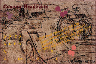
Custom Headlights is another Grunge type digital collage that I have created. I used a grunge texture background from Grunge Textures and two photographs of the headlights taken by my son Keir M Gatzka. The headlights are from a custom Camaro and a Supra.

I used PhotoPaint to do the entire collage. I opened the texture background first - resized it and sharpened it. I copied each photograph of the headlights from Picasa 3 and pasted in PhotoPaint on the grunge background.

Using Little Ink Pot's Thredgeholder I created the line drawings from the photographs, individually. I used the object property Color Burn on them both for transparency and merged them with the textured background. I added the paint splatters and dripping using Effects> Distort> Wet Paint> filter on the objects before I merged them with the background.

I added a chord progression from my files:

D D C D

G G F G

A C G

C Em F C

And also added a cut of some lyrics from my song, "Got Your Clouds in My Sky." ©2009 Kirk Mathew Gatzka, all rights reserved.

Got your clouds in my sky
some cumulus and cirrus too
raining like tears from your eyes
Why am I tearing up too

The chord and the lyrics do not match up the chords are different than the song itself. Feel free to experiment with the guitar chords. The lyrics are copyrighted.

----------------
Now playing on Windows Media Player: Kirk Mathew Gatzka - Got Your Clouds In My Sky
null

Sunday, September 27, 2009

Custom Taillight - Guitar Chords - Lyrics - Smooth Grunge


Custom Taillight is a grunge based piece. I opened a photo-
graph, taken by my son Keir M Gatzka, and ran Paint.NET's Artistic> Ink Sketch> filter on it, portrait sized I cropped it to fit a landscape "tire track in the sand" grunge background / texture from Grunge Textures in PhotoPaint.

I used a few different grunge fonts for the text of the guitar chords and a bit of lyric from my song "Autumn Day." I added a trio of paint splatters using the WC Rhesus B Bta font of splatters.

The guitar chords I used for this song are as follows:

Drop D / Capo 3rd Fret

D A G5 A Repeat 6 times

F#m Bm G Asus Repeat twice

D A G5 A Repeat 6 times

F#m Bm G Asus Repeat twice

D A G5 A Repeat twice

Am7 Em Em7 Em Em7 Em Repeat three finish on A7 hold back to beginning

The song "Autumn Day" is ©2009 Kirk Mathew Gatzka, all rights reserved. So please do not copy this progression but experiment with it to come up with your own combination. It is recorded on my CD "Beginnings."

----------------
Now playing on Windows Media Player: Kirk Mathew Gatzka - Autumn Day
null

Saturday, September 26, 2009

Digital Painting - Painter 8 - Acrylics / Blenders


Just recently I received a few photographs of my great-great nieces. They are lovely children so I decided to try my hand at painting them digitally. Using Painter 8 from Corel I used the Acrylic dry brushes and glazed brushes to paint the two of them in this pose. Using the Blenders I softened the faces and the hair. I used a Digital Watercolor brush on the glazed background and used the Blenders on it as well. I was using a Wacom tablet for painting also.

I am still new, even after a large number of attempts, at digital painting of portrait subject matter. I really enjoy Painter 8's versatility and the action of the different media brushes. I love my nieces and tried to do them justice with a good likeness.

I was torn between the darkness of the background, to lighten it or not, but I decided to leave it dark. I like the autumn colors and it seemed to recede enough to place the focal point on the portraits.

----------------
Now playing on Windows Media Player: Southwest Statistic - Grey (Final EQ Test 15)
null

Friday, September 25, 2009

Red Supra Boot - How Do You Value Digital Art?


Recently the discussion came up, again, as to the value of Digital Visual Arts. Even after decades of the practice of making digital visual art it is still devalued by some, as it is not done with the more Traditional Media. Oils, Canvas, Acrylics, Watercolors, Pen and Ink, Pencil, etc.

I have been creating Digital Visual Art since the mid 1980's and the question is still being debated, as it was from the beginning. I believe that the issues of permanence and longevity are at the seat of such a debate. I for one do not doubt the validity of the creative visual art made with digital tools, and believe that they have intrinsic value.

Much of my work is accomplished by deliberate action and planning, it is not computer generated, but created by myself, an artist. I have the composition, the colors, the subject matter well in mind like any traditional artist does, as I do my act of creation of visual art. This is definitely part of a traditional approach to the visual arts.

Also, my music, my songwriting, and recording it on the computer is done with forethought and creativity. It is not computer generated music. It is done with traditional values based upon my musical roots.

I believe that Digital Visual Art is only a choice of tools of creativity, thoughtful, deliberate, and full of value. But I am not an art critic nor a judge at an exhibition of art. I am simply a creative person, an artist, that has chosen digital tools to work with.

The debate will continue as it did with each new art movement, shock, chagrin, disbelief, acceptance, value. As long as society has these digital tools art will be made, enhanced, planned, and executed by artists in the digital form. Much like traditional visual art is.

----------------
Now playing on Windows Media Player: Kirk Mathew Gatzka - Can't Find My Way Home Cover
null

Wednesday, September 23, 2009

Zoomies Boot - Custom Car - Chord Progression


Tried Twitrratr (sp?) for my Twitter rating and received an A+ a 98/100 rating. Needless to say I was very pleased with that. My average tweets were low though so I guess I don't have that much to say on Twitter. But my content is good!

Today's image is a continuation of my classic custom car grunge series. It's titled "Zoomies Boot." The "Zoomies" comes from the license plate, and "boot" comes from what the English call the trunk of the car.

Once again I used Paint.NET's Artistic> Ink Sketch filter for the inked look. I applied, in PhotoPaint, a broken dryed mud texture from Grunge Textures. Added some text, the title and a guitar chord progression with a snippet of a poem. I used grunge fonts for the piece.

Yesterday I worked on a song called: "Crushing Me," about a stress filled situation. The title tells most of the story. I used the DADGAD tuning so it sounds very mournful and droning. It got out some of the stress and was helpful to sing and play and record it. It wasn't meant to be a happy theme.

----------------
Now playing on Windows Media Player: Kirk Mathew Gatzka - Crushing Me
null

Tuesday, September 22, 2009

Coupe DeJour - Return to Grunge


Life can be stress filled and each one of us has to cope. As a play on words here is a "Coup Coupe DeJour" grunge image, doing this image has helped me endure some recent stress. Creativity is calming for me.

In PhotoPaint I applied KPT's Collection Pyramid Paint filter and saved that image. I used CorelTRACE on the adjusted photograph and it simplified the colors and created a vector image to manipulate. I also used a texture from Grunge Textures for the browns.

Using CorelDRAW I selected pieces of the ungrouped vector image and moved them, breaking up the edges of the image. I added an off brown background to the piece and grouped them all together.

I saved the file as a bitmap jpg, and opened it in PhotoPaint. I added the grunge texture, copying and pasting it, using the object property of Multiply. Added some text and paint splatters with the Distort> Wet Paint> filter for the dripping.

Listening to some Blues:

----------------
Now playing on Windows Media Player: DukeRobillar
null

Monday, September 21, 2009

Man with Tie - Circa 2007 - Digital Manip


Another of my images from 2007, as I try to find time to make new images, these are in review. This is a Digital Manipulation and Painting from a photograph taken by my son Keir M Gatzka.

I utilized CorelTRACE on this piece to give it the posterized detailed appearance. I painted it in Painter 8 as well. I arrived at the colors by using KPT's Collection and an invert, if my memory serves me right.

The piece reminds me of the Blue Group somewhat but that has no relevance to the creation of it. Just concidence. I have garnered some interest in the image from various sources, so I decided to share it today.

The original is 3200x2648 pixels at 7.5 megs, 300dpi. So I resized it in PhotoPaint for display here. It is also displayed on my Fine Art America Gallery, where I have only a few pieces showing.

Last night I got out the 12-string guitar and played around with some chord progressions like:
C Am C Am F G and Am G Bm C D Em. Then I tuned to DADGAD and played some more before retiring to bed.

I also have had my Beatles song book out recently and have been plucking around with song's like "Mother Natures Son." Fun to do, trying out differing Artist's music.

Playing the guitar is very relaxing if you are not playing uptempo chord strumming. I haven't written any new lyrics, I have been busy with other projects and nothing has come to mind of late. Funny how that can happen to you, I guess I'm in a musical dry spell after a year and some months of creativity with some good songs under my belt.

----------------
Now playing on Windows Media Player: Kirk Mathew Gatzka - Watch the Wind Blow By Cover
null

Sunday, September 20, 2009

Custom Cars Digital Collage - PhotoPaint - Paint.NET


I found another Grunge background site. Through a Twitter source of design. Grunge Textures has a wonderful selection of background textures. I selected one that is a photograph of a blue stuccoed wall. And using one of my custom car paintings and some additional cars I created today's image.

I opened the textured photograph in PhotoPaint and sized it accordingly. I then opened one of my car paintings in Paint.NET and applied the Artistic> Ink Sketch> filter to it without any color. This I overlaid as an object onto the texture. A side point the original car was painted in a sky blue, and the background is a blue one as well.

I added another car taken from Dover clipart, with yet another vehicle from a auto-painted image I had done in Painter. These I shrunk down and applied the object property Multiply, and placed them on the piece. Using different grunge fonts I added some text from a chord progression and a clip of a poem/lyric, which did not come from a finished song.

I like this chord progression and I may have posted it before but it fit well in the image so I used it again. It is high time I did some music so I hope to find time, make time today to do so. My 12-string is calling me.

----------------
Now playing on Windows Media Player: Kirk Mathew Gatzka - You Escape
null

Saturday, September 19, 2009

ArtRage - continued - with PhotoPaint assist


Another painting done in ArtRage in 2007. I have used this image before in a collage I did, using it as a line drawing. Here I display it as it is originally. From a photograph by my son Keir M Gatzka and used as tracing paper in ArtRage.

I used all oil paint brushes for this piece. The assist in PhotoPaint was when I used the original photograph as an overlay object to bring in some highlights. Specifically the headlamp and the grill and emblem on the hood. I applied an opacity change to the overlay to let the details show lightly.

I really like the colors that ArtRage brought to the image, the light greens were unexpected with so much rust on the truck. The lines of the grill were a challenge, I made the oil brush as small as I could to get a finer line. The overlay helped here bringing back some details (see larger image.)

Still haven't had time to do any music but it is constantly before me as I work on these other projects. Stay tuned.

----------------
Now playing on Windows Media Player: Kirk Mathew Gatzka - Eleanor Rigby Cover
null

Friday, September 18, 2009

ArtRage - Revisited - Rusty Truck


I love old rusty trucks as subject matter. They make you reminisce about the days when they were working vehicles. What they might have hauled and who may have used them.

I have another ArtRage image that I used a photograph as tracing paper and the oil brushes and the pastels and textures. The bulk of this piece is light colors which make you focus on the old rusty truck in a field retired and out of commission.

I really like the impasto feel of the oils here and the textures of the pastels. It's a rough image of a roughly used vehicle that is well past it's prime. I imagine it as a farmers truck used on a farm. I don't know why but it just seems so.

As the last image I posted this was done in 2007 as I was experimenting with the free ArtRage program. I love the looseness and incomplete details of the piece. It lends to the feeling of decay and uselessness of the old truck.

Listening to music quite a bit lately. I have been very busy with other projects so I have not been songwriting of late. Nor have I been painting as much so I have reviewed my older works and displaying a few of them in my posts. I hope to be creating more with music soon and of course digital painting is on my mind as well.

----------------
Now playing on Windows Media Player: Kirk Mathew Gatzka - Hello Hello
null

Thursday, September 17, 2009

ArtRage Painting Oils - GMC Truck in Winter


ArtRage 2.5 is now available for only $25.00 US. For today's image I used the free version of ArtRage from a couple of years ago as you can see the copyright date on the print is 2007, that's when I did this painting.

I am not affiliated with the ArtRage folks but I really like the program for painting. It imitates oils and pastels very nicely. And you can't beat the price for what you get.

You are able to load an image to use as tracing paper and paint over it. It does a great job of being true to the colors of the traced image. This one is from a photograph taken by my son Keir M Gatzka.

I love the impasto feel that the oil brushes give you in ArtRage, they are very intuitive to work with and just plain fun. This image reminds us that winter is not too far away. I for one am not looking forward to it. It is a beautiful season, no doubt, but it is so cold and not my favorite season. I like the late Spring and Autumn. So I am enjoying the weather we are having right now.

----------------
Now playing on Windows Media Player: Kenny Chesney - On the Coast of Somewhere Beautiful
null

Wednesday, September 16, 2009

Alaskan Mountains - Late Summer - Painter 8


Using Corel's Painter, Digital painting is very much fun. You start with a subject and you select your brushes, in this case Acrylic and Digital Watercolor, and you paint. Using the tracing paper function allows you to duplicate nicely the composition you have selected in your original photograph of the subject matter.

In Digital you can adjust so many things that you feel will add to your image and you can try them, but if they don't work, you have the undo feature which you don't have using traditional media.

I selected another photograph taken by myself of the Alaskan mountains North of Anchorage. There were predominately gray colors for the foreground which I altered, in PhotoPaint, using Image> Adjust> Hue / Saturation / Lightness. I increased the saturation by about nine. Now the colors are tinted and have more depth to them.

I try and vary my subject matter in my Digital Artworks for the blog to keep it fresh. I am also doing more Digital Painting for a change and this leads to pieces like today's.

----------------
Now playing on Windows Media Player: Jeremy Fryc - if you put two v's close enough together they make a w
null

Tuesday, September 15, 2009

Theme Revisited - Acrylic Brushes - Painter 8


Revisiting a theme can provide differing challenges to an artist. I wanted to make this version of my wife and I using Painter 8 and the Acrylic brushes.

The smiles we both have are really nice, you can tell we were having a great time. This approach makes us both stand out more as well.

I used PhotoPaint on the background to make it recede some more. I applied the masking tool to each of us and then utilized the Effects> Custom> Alchemy> filter to the background.

I got out my 12-string guitar both last night and the night before and played before retiring to bed. I am playing with some chord progressions. Em and A, uptempo with hushing the strings and making a beat before switching to the A chord. Then a quick change to C Em D holding the D for a few extra beats. I don't know if this will lead to a song. I am just trying a different tempo and type of strum with these chords.

All in all having a nice time practicing this set of chords.

----------------
Now playing on Windows Media Player: Green Day - Wake Me Up When September Comes
null

Sunday, September 13, 2009

A Quick Digital Pen Ink Watercolor - Painter 8


This image was taken from a photograph of my wife and I at a Big Boy Restaurant by my son Keir M Gatzka. I applied my Digital tools to it.

I first opened it in Paint.NET to get the pen and ink look using the Artistic> Pen Sketch with no color just black and white. Saving this file I opened it in Painter 8 along with the full color original selected as clone source. I used the watercolors brushes on it giving it that washed look.

Saving the file again I opened it in PhotoPaint and applied a mask to the faces and clothing and used the Effects> Custom> Alchemy> filter on the background to add a dabbed appearance. I chose the Tone Curve tool to lighten the image to give it a washed appearance.

----------------
Now playing on Windows Media Player: Guess Who - She's Come Undone
null

Saturday, September 12, 2009

Rhymes - 57 Chevy - Chord Progression - Grunge


Rhyming and songwriting can be a lot of fun letting ones creative juices flow. I have taken the liberty of combining a Custom 1957 Chevrolet photograph (from my son Keir M Gatzka) with a floral wallpaper grunge texture, some rhymes, a partial song with chord progression to create today's image.

The song "Riding With Me," is a simple lyric and a simple chord progression I had some fun recording a while back. It's a Bluesy Rock n Roll tune. The rhyming was from a text file of rhymes I have for reference. The floral grunge wallpaper is from Autumnights.

I opened the car photograph in Paint.NET and used the Ink Sketch filter on it with a high coloring selection. I overlaid the floral texture in PhotoPaint using the object property Color Burn. I found my text file and song in my files and cut and pasted them in using a few different fonts. I added the paint dripping using Effect> Distort> Wet Paint> filter on the objects and text.

The car is a Classic Custom that many find unforgettable, and the yellow paint job contrasted nicely with the floral grunge texture.

Again I combined my interest of art, cars, and music together for this piece.

----------------
Now playing on Windows Media Player: Kirk Mathew Gatzka - Riding With Me
null

Friday, September 11, 2009

Alaskan Mountains Motif - Painter 8 and PhotoPaint


Continuing with the Alaskan Mountains motif today's image is a bright piece of mountain scape. I took this photograph with my Canon Rebel North of Anchorage on our first day trip.

The sky in the original image was so white I painted it out and added a piece of the sky and pasted it in. I opened the painted image done in Painter 8 with liquid ink brushes with PhotoPaint and used KPT's Collection Pyramid Paint filter. I added some light detail with the Thredgeholder filter. I had also adjusted the saturation and brightness of the colors for impact.

These mountains are beautiful and impressive. Not as rugged as some mountains are, the gentle slopes are relaxing in real life and I hope some of that is conveyed in the painted image.

----------------
Now playing on Windows Media Player: Kirk Mathew Gatzka - Can't Find My Way Home Cover
null

Thursday, September 10, 2009

Power Outage Shuts Down gatzkART Temporarily


Because of a fallen tree here locally I was made painfully aware of the dependency we have on electricity. We experienced a Power Outage because of that fallen tree - for hours.

It took all afternoon and part of the evening to have the electric power restored. With little extra time to spend going to a local Starbucks or other wifi hubspot I was unable to post to my blog. So I had to wait till time and power made it possible once again to connect and post.

I am using another Photograph of Alaskan mountains for my image today. I used PhotoPaint to take a previously used photo and make a new piece. It is one of my favorite photographs of the mountains I took.

I cropped the photo to make it less centered and moved the far mount off center. I used KPT's Collection Pyramid Paint filter for a painterly look and then I took the image through the Thredgeholder for a sketchy appearance. I copied that to the clipboard and undid the action. Pasting it back onto the image as an object I used the Object property Color Burn to add it with transparency. This gave me lines and details.

I masked the mountains out and used the 3D Effect> Glass on the sky. I upped the color saturation by about fifteen to enhance the colors. I also lightened the image using the Tone Curve adjustment just a bit.

I am happy that the power is back on and I am online again for today. It was very different day without being online.

----------------
Now playing on Windows Media Player: Kirk Mathew Gatzka - Photographs
null

Tuesday, September 8, 2009

Alaskan Mountains - Acrylics/Watercolors - Painter 8


Last night I took a chord progression and sung a melody for my recently posted lyrics about "Photographs" and finished the song. I was up late working on it in the quiet of the night time.

The progression I used is G Am Bm A5 with the chorus C Em D and the bridge A5 G. I added a lead track into the new beta release of Audacity 1.3.9, which is almost ready for the 2.0 release.

If you look back a couple of posts you can read the lyrics in whole. It is based on other songs that sing about photographs and love.

Today's image is from a photograph taken on a road trip in Alaska. I used Painter 8 and PhotoPaint to paint it and give it some highlights. I really enjoyed painting this piece. I love the mountains of Alaska. These are North of Anchorage. We hope to return to Alaska some time in the future.

----------------
Now playing on Windows Media Player: Kirk Mathew Gatzka - Photographs
null

Monday, September 7, 2009

No Rhyme No Reason - Add Rhyme Got Reasons - Corel PhotoPaint


Texture from Autum-
nights
, Photo-
graph of Black Hot Rod from the Wood-
ward Dream Cruise
, A title, Some chord progressions and lyrics, Some rhyming and you have the pieces to today's image.

This was compiled in PhotoPaint, and also Paint.NET for the ink like car photograph. I return to grunge as a genre accompanied by my interest in music and my own songwriting. The lyrics and chord progression come from my song "Can You Please Love Me?" ©2009 by Kirk Mathew Gatzka. The rhymes come from using a rhyming dictionary.

I added the texture by cropping it and pasting it as an object in PhotoPaint using the object property of Color Burn and an adjustment to opacity. I copied and pasted the text using my song from Notepad text files and a few different grunge fonts. And I used the rhymes from a compilation I put together.

I have yet to come up with a chord progression and melody for my recently posted lyric. I am working on it in my mind and soon will get the 12-string out and write a full blown tune.
----------------
Now playing on Windows Media Player: America - Ventura Highway
null

Sunday, September 6, 2009

Grunge When is Ugly Attractive? - Corel PhotoPaint


Can ugly be attractive at the same time? Working within the grunge genre one has to question this. Grunge is fascinating, the amazing textures the colors the implications. Take today's image for example.

Grunge green dominates the image. But if you look very close you see the street sign "Lovers Lane." A real street near Battle Creek, Michigan. Also looking closer you can make out the Gaussian blurred kiss in the center of the piece.

So is this piece too much Grunge or just enough to make it more interesting? Using PhotoPaint I merged 3 images to create this image. The Kiss from some marriage photographs, the floral grunge texture from Autumnights, and the photograph of "Lovers Lane."

Each image was manipulated prior to their merging into the single image you see here. I used a filter on the lovers lane photograph to simplify it. I used the Gaussian blur on the wedding kiss. And I used the object property Multiply on a piece of the floral grunge image.

What I see personally is a piece with depth. But even I wonder when is manipulation too much? I say it is when the images by themselves won't stand on their own, you manipulate till the image says something to you, as an artist. Then you stop.

Granted the image may not appeal to all who view it, but it will make a person look more closely at it to see the pieces put together. In part that is a successful image. If it holds their interest more than a cursory glance, you have accomplished something. That something is important to the artist. When the choice is made as to if one likes the image as it stands is very personal and should be allowed for every viewer. Like it or not, they have an opinion. That's the beauty in it.

----------------
Now playing on Windows Media Player: Arlo Guthrie - City Of New Orleans
null

Saturday, September 5, 2009

Grunge Revisited - Corel PhotoPaint - Sweet Sensations


I spend quite a bit of time looking through photo-
graphs for my artworks. I am using Picasa 3 for keeping my images and photo-
graphs in order and easily found. I really recommend it for tracking images.

Today's image is a return to the Grunge image. I found a really good photograph by my son Keir M Gatzka. This was taken at a Ram's Horn Restaurant.

I opened it in PhotoPaint and used KPT's Collection Pyramid Paint filter on it. I chose the blue tints in Pyramid Paints selections. Then I ran the Thredgeholder filter on a copy of the image for details. This is superimposed on the image for a grungy appearance.

I opened a grunge texture made by Autumnights which is of an old floral wallpaper. I like the contrast of the blue with the red of the flowers. This I overlaid with the object property of Multiply for transparency.

I had a large file to begin with so I cropped it a bit losing some unwanted elements, and resized the finished image in PhotoPaint with a 25% reduction as a jpg for display here.

I like the typographical feel in this piece. "Sweet Sensations" from the paper placeholder on the restaurant table. And I like the angle at which it was taken.

While listening to music creating images I was surprised to find more than one song referring to photographs and love. I opened Notepad and wrote a lyric of my own:

Title: Photographs
Author: ©2009 Kirk Mathew Gatzka, all rights reserved.

Verse:
I listen to pieces
I hear songs about photographs
How they write paragraphs
About their love
About their love

Verse:
I pick up the pieces
Of my life as photographs
They are only pictographs
About my life
About my life

Chorus:
They don't define
What is really mine
They are only part
Of my daily art.

Verse:
I hold up the pieces
Scanning the photographs
They are like autographs
About my loves
About my loves

Chorus:
They don't define
What is really mine
They are only part
Of my daily art.

Bridge:
I take the pictures
I am never in
I am at the shutter
Taking it all in

Verse:
It's like a window
Frozen in time
More than hinges
About my life
About my life

Chorus:
They don't define
What is really mine
They are only part
Of my daily art.

Now to find a good chord progression and a melody and I'll have a new song to play.

----------------
Now playing on Windows Media Player: Avril Lavigne - Keep Holding On
null

Friday, September 4, 2009

David - Fun with Filters - Corel PhotoPaint


Occasion-
ally I like to experi-
ment with using differing filters on a Photo-
graph. Today's image shows David relaxing with a drink. I chose to use two programs.

In Paint.NET I used the Pencil Sketch filter and saved that file. I opened the original photograph in PhotoPaint and also opened the pencil sketch and copied it to the clipboard.

In PhotoPaint I used KPT's Collection Pyramid Paint filter on the photograph. It gave it a painterly appearance, then I pasted the pencil sketch onto it and used the object property Color Burn on it for transparency. I merged those objects.

Using the mask cutout tool I cut out David and used the filter Effects> Custom> Alchemy> for the background, leaving David the same. I inverted the mask and applied the Effects> Distort> Wet Paint> filter on David with it set very light for painterly dripping.

I used the Little Ink Pot's Thredgeholder to create another bit of detail and copied it to the clipboard, undid it and pasted it as an object. I used Color Burn again to make it transparent. The last application was the use of the Image> Adjust> Tone Curve and darkened the image a bit.

You see the results of my use of these various filters and cutting, masking and applying.

----------------
Now playing on Windows Media Player: Metric - Come Back Baby
null

Thursday, September 3, 2009

Chevy - Pen and Ink /Watercolor - Painter 8


Just a short post today, very busy day. Here is an image that began as a photograph, opened in Painter 8. Using the Ballpoint Pen brush I sketched the car with few details. I switched to a Flat Ink pen for the coloring of the car. Then for the background and some added color I chose a watercolor camel brush.

Painter 8 is just great to use for such pen and ink and watercolor pieces. Using my Wacom tablet it is like very much like traditional pen and ink and watercolor painting.

The original photograph was taken by my son Keir M Gatzka.

----------------
Now playing on Windows Media Player: Kirk Mathew Gatzka - While My Guitar Gently Weeps
null

Wednesday, September 2, 2009

Our House - Painter 8 Watercolor/Pencil


Detailed painting requires patience, the tiger lilies in our front and side garden required that as I painted today's image. It's another view of our house I used the watercolor clone brushes in Painter 8. I had run the original photograph through Paint.NET's Pencil Sketch filter and added that in PhotoPaint for some detail as well.

I enjoy the end result of the watercolors plus the pencil sketch together. Part of the piece is light and airy, part darker and full. That's why I enjoy them so much.

I also used the Tone Curve in PhotoPaint to lighten the colors a bit so the painting wasn't as dark as it started out. It allowed the pencil markings to show through and give it the detailed touch.

On the music front I finally bought an MP3 Player, it's only two gigabytes but it holds approximately 1000 songs. I am listening to some of my own songs right now using it. I got it for help with exercising. I have a treadmill that I can use in inclement weather, and of course can take it with me on walks around the neighborhood. I am too sedentary, I sit a lot before this computer doing art and blogging.

So it isn't helping right now as I listen to music on it while sitting. I need to move!

----------------
Now playing on Windows Media Player: Kirk Mathew Gatzka - Speedboat Waves
null