Pages

Sunday, October 31, 2010

Two Images Today - Grandson - Old Dodge Truck


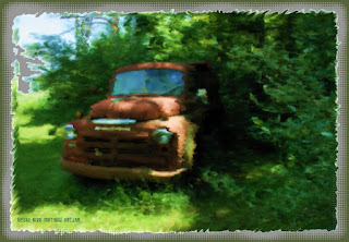
I did two images for today's post one of my Grandson and the other of an old Dodge Truck.

The truck photograph was taken by myself and is a favorite motif of mine. I followed a Painter PDF tutorial by John Derry that I had saved quite awhile ago. It included Auto painting of the photograph.

I added the oil brushstrokes from the Painter 8 Wow! Book oil brushes. And by hand painted the rough edges, then added a border and a halftone frame from Filter Forge's Freepack 3 Frames.
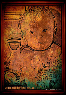
The second image of my Grandson, Zeke I used Paint.NET. I applied the Effects> Artistic> Pencil Sketch> with the pencil tip turned all the way up. I saved that file and opened it in PhotoPaint where I also opened a copy of a Mayang's Texture of painted rust. I overlaid the picture of Zeke onto the texture and used the object property Multiply to make the white transparent so as to show the texture.

So here he is "Cute thanks to Mom and Dad." I did finish the image with Filter Forge's Frames using a film frame, adding a border and another file frame. I also used the Tone Curve on the image for depth and upped the saturation by 7 for boosting the colors of the rusted texture.

I hope you enjoy both of these images and explanations as much as I enjoy presenting them and telling a bit about how they were made.

----------------
Now playing: Kirk Mathew Gatzka - Smooth Riding
via FoxyTunes

Saturday, October 30, 2010

Jazz Poster - Dover Publications - PhotoPaint - MixCraft 5


Digital Collage is very interesting to me as a creative outlet. I received some Dover Publications clip art that included a poster for the Fillmore Jazz Festival which intrigued me.

I opened the poster in PhotoPaint and then in Picasa 3 I located one of Mayang's Textures. I copied this to the clipboard and pasted it as a new image in PhotoPaint. Here I used the rectangular tool to cut out a portion of the texture that was a bit larger than the poster. I copied it to the clipboard and pasted the cut piece as a new image.

Switching to the poster I copied that and pasted it into the texture as an object. I used the property Multiply on the poster to make it semi-transparent to allow the texture to show through. I placed the poster in the texture and merged it with the background.

I added some more Dover Clip Art pieces to the poster, a Victorian corner, and an Art Deco piece. Placing them in the corners of the image I created additional balance for the image. I used Filter Forge's Frames to add a film frame.

In music I have decided that using MixCraft 5, though a good program overall, isn't really for me. It made my tunes sound generic and like a lot of songs that are already commonplace.

I've enjoyed my trial period using the program but I prefer to continue to use Audacity for recording my own work, which sounds more original and different than mainstream music.

However I do recommend that you try out MixCraft 5's trial copy for yourself as it may suit you and your approach to recording, the mixing ability is it's strongest feature. It is a fine product for making and recording music.

----------------
Now playing: Kirk Mathew Gatzka - Spaced Out
via FoxyTunes

Thursday, October 28, 2010

Cowgirl Contemplation - Vector Graphics Experiment - CorelTRACE - CorelDRAW


Today's image started out with a photo-
graph That I found in Picasa 3 browsing, without any credits. The photographer is unknown to me. If you recognize it please write me so I can give proper credit to them.

I opened the photograph in Paint.NET and applied the Ink Sketch filter to it. Saving the large file I opened it in PhotoPaint and adjusted the Tone Curve and saturation. Here I added some Dover Publications clip art and I saved the large file and I took the image and traced it for a vector graphic in CorelTRACE cmx file format. This gave me a posterized vector to open in CorelDRAW.

In CorelDRAW I ungrouped the image vectorized pieces and pulled some apart from the original, providing some white gaps to fill. I used the Rectangle tool to create one that I placed behind the pieces. I added a brown color to the rectangle and had my background and fill color.

I copied this to the clipboard as a grouped image. Reopening PhotoPaint I resampled that to 1200 wide and save as a jpg. Here I added the framing using Filter Forge's Frames. I saved this jpg for display here.

I'm continuing with my trial copy of MixCraft 5 to create some music. I am really enjoying using it and am learning to control the mixing much better. I've done a number of tunes which I am reviewing them as I type this.

I did find out that I can open them in Audacity as MP3 files and I applied the Dynamic Compressor to clear up some of the distortion of lyric singing. I have to find the same effect in MixCraft 5 as I am certain they have the same thing.

Yesterday I recorded an instrumental "Upper Heights," and a Blues song with fun lyrics sung and rhythm and lead played by me called "Come Home Blues." I enjoy playing my guitar and singing along with the arrangements I create with MixCraft 5 using my Toneport and the Gearbox software along with it.

----------------
Now playing: Kirk Mathew Gatzka - Come Home Blues
via FoxyTunes

Wednesday, October 27, 2010

Feel like a Number - PhotoPaint - Experiments with MixCraft 5


Just the other day I was listening to some Bob Seger songs and "I Feel Like a Number," came on. So I did a search in Picasa 3 for pictures with numbers in them and found this photograph.

I took this photograph with my older 5.2 megapixel camera and the dpi was 72. So I upped the dpi to 128 in increments to save some detail in PhotoPaint.

I also boosted the depth with the Tone Curve darkening it a touch. Then I upped the saturation by 15. I used the Effects> Artistic Strokes> Watercolor> filter on it. And I added a halftone frame in Filter Forges Frames in blue. I added a border of Navy blue and then the green halftone frame with another border of Navy blue.

I have only a few days left for my trial of MixCraft 5 and I have been having a blast trying to use it to the fullest I can before it expires. I've experimented with 8 tunes so far, ranging from Techno to Country Rock. The biggest problem I have had is during the mixing in of the vocals. I have been getting them too driven and it distorts them. I have tried adjusting the input levels so that doesn't happen, but, I still have some distortion.

I am confident it is my own inexperience with this fine program. I have learned to adapt to making the tunes more my own with help from their library of drums, bass, guitar, organ, piano and other synth sounds and effects.

I also found out at their site that they have a Pro Studio version for $149.00. I very much doubt I'll be able to budget in either of these programs. But if I could I would buy MixCraft 5.

The last two songs I worked on are, "Use it or Lose it," and "Don't Leave Me Alone." Both are Rocking tunes. But the vocals are distorted so I am not real happy with them. I need more mixing experience. It's coming along.

----------------
Now playing: Kirk Mathew Gatzka - Don't Leave Me Alone
via FoxyTunes

Tuesday, October 26, 2010

MixCraft 5 Recording Studio - Abstract Guitars - PhotoPaint


I haven't talked much about music lately. Here is an older Guitar Abstract image I did in PhotoPaint using photographs I had taken.

I used a lot of cut and pasting for the multiple guitar look and feel. I also upped the saturation by 15 for highlighting the color.

Using Filter Forge's Frames I added a dual frame to the piece by using Image> Papersize> color white adding 30 pixels then a film frame then adding 30 more pixels and another film frame.

I have been using a trial period of a program called MixCraft 5 [click here] for some musical experiments. It's like a Garageband for PC users. I have been enjoying the trial period but I noticed that many of the samples of the program make my songs sound generic. I did a Country song "Sweet Laurie," and it came out nice but did not sound like my style of writing at all. I used a Gmaj key with a repetition of the G C D chords, very simple.

I added their samples of loops for drums, Acoustic Guitar, Electric lead Guitar and Bass. It sounded nice, but, like almost any Gmaj Country song you've ever heard before. I played my 12-string Guitar and sang a simple lyric to the accompaniment of the other instruments.

I need to experiment with it some more to see if I can make it work for my style of writing. Basically it is a good program and allows mixing of samples they provide and sound effects and plenty of fun. I would recommend it for the trial at least. It goes for about $75.00 and is not that expensive for what you get with it.

I also recorded another piece called "Crazy Eights," using eight bar snippets from Sludge Metal for an intro to a Power Ballad. I used all samples from them and did not play or sing on this experiment. All in all a good program and a lot of fun.

----------------
Now playing: Kirk Mathew Gatzka - Sweet Laurie
via FoxyTunes

Monday, October 25, 2010

Roses and Watermelon Wedges - Paint.NET - PhotoPaint


A floral photograph taken by my son Keir M. Gatzka near Lansing, Michigan. Along with the roses if you look at the left hand upper corner you can make out wedges of ripe watermelons. This photograph catches ones eyes because of the colors and the delicate floral on an angle, one of my sons favorite motifs.

I touched up this image using a painterly filter in Paint.NET, where I also resized the image for psoting on the blog. I adjusted the Curves also giving the color and image depth. I saved that file and opened in PhotoPaint.

In PhotoPaint I upped the saturation of color by 9 for a boost to the natural colors of the photograph. I added a film frame using Filter Forge's Frames. Then I added an autumn orange border to which I added another film frame for an enhancement to the framing of the wonderful floral.

----------------
Now playing: Kirk Mathew Gatzka - Sweet Laurie
via FoxyTunes

Saturday, October 23, 2010

Line Art - Line Dancing - Paint.NET - PhotoPaint


Line Dancing has been a favorite for a long time. While attending a Graduation Party I took a couple of photographs of the younger crowd dancing. The theme was a Mexican fiesta, with a lot of ethnic food and fun.

I used one of Mayang's Textures for the background and altered the photograph to a ink line drawing in Paint.NET. I opened both in PhotoPaint and merged them using th Object Property> Color Burn> on the dancing to make it transparent.

I also used the Tone Curve on it to darken and give depth to the grunge texture. I added a film Frame from Filter Forge's Frames and gave it a wider black border using Papersize in PhotoPaint. All in all a simple project for your perusal.

----------------
Now playing: Bob Seager - Night Moves
via FoxyTunes

Friday, October 22, 2010

Faux Fur - Art Deco - Paint.NET - PhotoPaint - CorelDRAW


Faux Fur is better than the real kind that they used back in the Twenties. This image was inspired by a photograph of a rusted floral piece of metal work and some Dover Publications Clip Art.

I took the photograph and resampled it to 1200 wide and then in Paint.NET I used an Invert filter on it. Then I used a painterly filter on it to give it a mosaic look.

I imported it to CorelDRAW and added the blue lines of the flower in the center. Copying that to the clipboard I opened PhotoPaint and pasted from the clipboard.

I browsed my Dover Clip Art and found the Ladies in Fur and some Art Deco pieces and cut and pasted them into the blue image. The result is a floral piece with a strong center and related time period imagery.

----------------
Now playing: Blind Blake - West Coast Blues
via FoxyTunes

Thursday, October 21, 2010

Grandson Zeke - Expression Value - Paint.NET - PhotoPaint


Does everyone really love baby pictures? Well I have really gotten interested in them since I became a Grandpa. I love the expressions you can capture when taking multiple photographs of your grandchild.

I used a very simple approach to this image as I wanted his expression say it all. Opening in Paint.NET I applied Effects> Artistic> Pencil Sketch> to the RGB 24-bit photograph. I upped the pencil tip to get a good likeness of a drawing.

Saving that I opened it in PhotoPaint and applied Image> Color Mode> Quadtone> to the image and then converted it back to RGB. I darkened the image a bit for shadows and highlights while making the quadtone.

I then added Filter Forge's Frames film frame to the image to complete it. Very straight forward steps to this piece. I love his expression! I resampled the image for display here.


----------------
Now playing: Kirk Mathew Gatzka - Speedboat Waves 2
via FoxyTunes

Wednesday, October 20, 2010

Milestone Reached for gatzkART! * 10,018 Pageviews


gatzkART! has reached a new milestone according to Google analytics:
  • 10,018
  • Pageviews

    We are grateful for all of you who follow us on a regular basis and continue to do our best to provide interesting and informative postings and Digital Visual Art and Music Discussion.

    Here is an image done from a photograph taken by my son Keir M. Gatzka of a young engaged couple hugging. I used similar techniques as other photographs in Paint.NET, PhotoPaint, Filter Forge's Frames. I used autumn tones for this warm image.

    Thanks again for your patronage!

    Sincerely,
    Kirk Mathew Gatzka

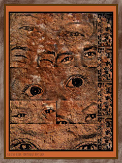
Smiling Eyes - Digital Collage - Paint.NET - Picasa 3 - PhotoPaint


I was inspired to do this image by an emailed newsletter of an another artists work that he had done in slums. He created huge photographs of faces and eyes and placed them conspicuously in slum areas around the world. I was particularly taken by the use of eyes.

I opened Picasa 3 and browsed my portfolio of faces. Selecting the eyes was not difficult as I have many portraits in the portfolio.

I opened a new file in PhotoPaint of 1200x768 and using the found faces I cut and pasted them into that file. Saving the file I opened it in Paint.NET and selected Effects> Artistic> Pencil Sketch and altered the image and saved that file.

Back in Picasa 3 I found my folder for Mayang's Textures and selected one and opened it in PhotoPaint. In Picasa 3 I copied the eyes on to the clipboard and then pasted into the texture. I used the Object Property of Multiply to make the white transparent.

I resized the pasted eyes to fill most of the texture. I then went into Dover Publications folder and selected a small border for the right side of the piece. Here I also used the Object Property Multiply to make the white transparent. I cut and pasted the clip art and duplicated it to build the right edge border. I used the Tone Curve to darken the blacks and deepen the color of the texture.

Still in PhotoPaint I added a black border and a brown border. The using Filter Forge's Frames I applied a painting frame to the image.

One thing I liked about doing this is I was able to get most of the eyes from smiling faces. So it is a pleasant piece.

----------------
Now playing: Kirk Mathew Gatzka - Laughing At Me
via FoxyTunes

Monday, October 18, 2010

Dried Goods Shopping - Paint.NET - PhotoPaint - Painter 8


Shopping for dry goods at a very great store in the Lansing, Michigan area, my son Keir M. Gatzka took this photograph. Beans and Garlic and other legumes were in these baskets all lined up.

I opened the photograph in PhotoPaint and resampled it to a slightly smaller size to work with the image. I used the tone curve to lighten and give depth and upped the saturation by 15 for great colors.

Saving that I opened it in Paint.NET and applied Effects> Artistic> Ink Sketch> with the color turned up to full and the lines lessened. I then applied a painterly filter for a brush stroked appearance.

Using Filter Forge's frames, now back in PhotoPaint, I applied a watercolor frame adjusting the thinness and the color of it to a golden brown. I gave this a black 10 pixel border and added a 50 pixel border using Papersize selecting another brown color.

I took this image into Painter 8 and used Apply Surface Texture> Image Luminance> for a brush stroked look and feel, adding texture to the piece.

----------------
Now playing: Kirk Mathew Gatzka - Peaceful Tones
via FoxyTunes

Saturday, October 16, 2010

Another "Eye" - Paint.NET - PhotoPaint


Today's image is another "Eye" and texture based piece. The Photograph was taken by my son Keir M. Gatzka of his wife's eye as he played around with our camera.

I opened the photograph in Paint.NET and used Effects> Artistic> Ink Sketch> with the color turned off for the black and white eye. I copied this to the clipboard.

Using Picasa 3 I found a Mayang's texture with a paint burst and some rust and opened this in PhotoPaint. I resized the texture to 1200 wide. I pasted the eye and used object properties Multiply to make the white transparent. I adjusted the eye before I merged the two.

Again I used a piece of Dover Publications clip art for the bird. And I applied the same Multiply to clear the white. I resized it to fit the image and placed it in the corner. Using Filter Forge's film frame I added the frame.

----------------
Now playing: Kirk Mathew Gatzka - Collision Warning
via FoxyTunes

Friday, October 15, 2010

Colasanti's Gift Shop - PhotoPaint


Awhile ago we took a day trip to Colasanti's Store / Greenhouse / Gift Shop and I was able to get some photographs of the Gift Shop and it's busy-ness.

This photograph was taken by me of part of the shop that greets you as you walk in the door. I was taken by the paint of the Hen and Chick along with the tiled word "Grow."

I did very little to adjust the original photograph. I opened it in PhotoPaint and adjusted the Tone Curve to give it depth and upped the saturation by 7 to boost the color a bit. I framed it with Filter Forge's film frame. After I had made my adjustments I resampled the image for display here on the web.

I love the collection of objects displayed here, you get the flavor of the Gift Shop right away, full of interesting things to browse and shop.

----------------
Now playing: Kirk Mathew Gatzka - Hook, Line and Sinker
via FoxyTunes

Wednesday, October 13, 2010

Zeke Dancing - Digital Collage - Paint.NET - PhotoPaint


Babies can be fas-
cinating. Here is Zeke striking a pose as if he is dancing his day away. Good thing that Grandma had a hold of him, though.

For this image I opened the photograph in Paint.NET and applied the Ink Sketch filter with no coloring to get the black and white only image. I also cropped the photograph to focus on Zeke's pose.

I opened PhotoPaint and found one of Mayang's Textures and also cropped out a section for this piece, as I wanted the details of the wood texture. I copied and pasted a Dover Publications Art Nouveau banner and a classic corner emblem and then added the image of Zeke Dancing. I added the dark brown wording to the banner stretching the font style I had selected.

In PhotoPaint I added a Filter Forge's film frame and my signature.Digital collage is very enjoyable to do and with so many choices one makes on the fly lends to creativity.

----------------
Now playing: Kirk Mathew Gatzka - Watch the Wind Blow By Cover
via FoxyTunes

Tuesday, October 12, 2010

Grandson in Autumn Colors - Painter 8 - PhotoPaint


Visiting with my Grandson always garners me a few nice photo-
graphs of him. I really enjoyed my time spent in Painter 8 doing a painting based upon one of the photographs I took yesterday.

I used the Chalk Tapered Chalk brushes for the muck up of the image. I varied the size of the brushes and completed that. I then switched to the Soft Cloner brush for detail of the eyes, nose, mouth, etc.

I opened a new Watercolor layer and used differing watercolor brushes for the background with light to dark bringing in the browns and oranges from the shirt and hair. I also used the straight cloner brush for the monkey and some other details on his arms and hands, fingers.

I liked the angle he was sitting in, in this photograph so I selected this one to paint and portray Autumn colors. I also used PhotoPaint and Filter Forge's watercolor frame with a light orange tint. Here is Zeke.

Monday, October 11, 2010

Bald Eagle Lake Sunset - Paint.Net - PhotoPaint - Painter


Sunsets in Autumn are unusually beautiful and over a lake even more so. Here is a piece from a photograph of a sunset over Bald Eagle Lake, near our home.

I opened the photograph in Paint.NET and used a painterly filter on it boosting the coarseness of the brushstrokes. In PhotoPaint I added a watercolor frame with Filter Forge's frames, used the Tone Curve and upped the saturation a bit. I added the wrought iron fence from some Dover Publications clip art.

I saved that file and opened in Painter 8 to Apply Surface Texture> Image Luminance> for texture.

----------------
Now playing: Kirk Mathew Gatzka - What Are You Afraid Of?
via FoxyTunes

Saturday, October 9, 2010

Vases - Paint.NET - PhotoPaint - Painter 8


Vases began as a photo-
graph taken by my son Keir M. Gatzka. He loves to experi-
ment with angles and macro images.

I opened the photograph in Paint.NET and applied Effects> Artistic> Oil Painting> for a brushstroke feel. I also used another painterly filter for simplifying the strokes. This gave it a posterized appearance.

Next I applied Effects> Artistic> Ink Sketch> with the color turned up for full tonality and the ink lines. Saving that I opened in PhotoPaint and used the Tone Curve on it to lighten it a bit for depth and upped the saturation for those bright pinks. I used Filter Forge's film frame to add a black frame.

Saving again I reopened in Painter 8 and used Apply Surface Texture> Image Luminance> for additional texture. I saved this as 100% quality for the display here.

----------------
Now playing: Kirk Mathew Gatzka - I'm Counting On You 3 Acoustic
via FoxyTunes

Friday, October 8, 2010

Large Eye - Vector and Painting - Experiment


Another experi-
ment with the spiral and line adjust-
ment tool in CorelDRAW and Painter 8 along with PhotoPaint.

I also used some Dover Publications clip art to add to the image. I used a similar technique as I did on yesterdays image of an eye. Please review the procedures I used in my previous post and you will get the idea of techniques used.

The Eye has always been the fascination of many artists and abstract images of it abound in art. [click here for Wikipedia's Eye article] You can also do a search in one of the popular search engines for IMAGES of eyes. Try "Eye Artwork," I did and I found many interesting pieces of art of the eye.


----------------
Now playing: Kirk Mathew Gatzka - When Our Eyes Met
via FoxyTunes

Thursday, October 7, 2010

Vector - Collage - Painting - Experiment


Today's image started as a new file in Painter 8. I was testing the speed of a large watercolor brush and an ink brush and made the textured background.

I saved that file and opened it in PhotoPaint and added two pieces of Dover Publications Clip Art. One is a circular emblem, and the other was a floral frame. I adjusted them to fit the image and used the object property Multiply to add them to the background.

I copied to the clipboard and opened CorelDRAW and pasted the image there. I then made some vector pieces to frame the center piece. To create the center piece I used the spiral tool and thickened the line. I then used the line adjustment tool to move the lines and curves to their new position. This gave me a vector object somewhat like an "Eye."

I grouped these together and copied to the clipboard, opened PhotoPaint and opened from the clipboard. I saved the large file and then I resampled for display here. All in all a enjoyable experiment with pleasant results.

----------------
Now playing: Kirk Mathew Gatzka - Collision Warning
via FoxyTunes

Monday, October 4, 2010

Jars and Jars - Angled


Shopping can be an exper-
ience
in unusual places. Products displayed in row after row. Thus today's image "Jars and Jars - Angled."

The original photograph was taken by my son Keir M. Gatzka. and it includes myself and my wife surrounded by products during a shopping period at a very peculiar store.

What attracted me to this photograph was the repetition of line and products and the angle that the photograph was taken at.

I used Paint.NET for the line art applying the Ink Sketch effect to it. I took another Mayang's Texture for the background and merged the two together using object property of Multiply in PhotoPaint. I applied Filter Forge's frame film frame. I applied the Tone Curve for depth and upped the saturation a tad for color boost.

Listening to Rock/Pop/Folk NPR - WXPN online.

Sunday, October 3, 2010

Apples - Cider Anyone?


Autumn is upon us and so is the Apple season! Plenty of Cider and Donuts for everyone, Please.

This image is from a photograph taken by my son Keir M. Gatzka at a vendors apple bin near Lansing, Michigan. I took the photograph into Paint.NET and applied the Effects> Artistic> Ink Sketch> to it for the line work. Then I used a painterly filter on it to soften it a bit. I altered the saturation also in Paint.NET, then brought this into PhotoPaint.

There I applied Filter Forge's watercolor frame to it for the white bordering. I took that into Painter 8 and used Apply Surface Texture> Image Luminance> on it for the painterly brushstrokes look and feel.

Back in PhotoPaint I made a 10 pixel black border and added my signature and saved for display here.

I can't wait for our trip to the Cider Mill!

----------------
Now playing: Kirk Mathew Gatzka - Autumn Day
via FoxyTunes

Saturday, October 2, 2010

Vector Graphics - Paisley Face - CorelDRAW


I really like Mayang's Textures and I used another one for this image. It began as a doodle in CorelDRAW creating some swirled objects that I extruded slightly and added bright blue to it.

I used duplicates to create the mirrored swirls to make the piece symmetrical. I added a paisley like object and when I duplicated it I saw an odd face.

So I added a nose and mouth to it to give it that facelike appearance. I imported one of Mayang's Textures into CorelDRAW and used it as the background. I grouped all the pieces together and copied to the clipboard. Then in PhotoPaint I opened it from the clipboard. It was a large 300 dpi file. I resized it for display here and I also added a film frame from Filter Forge's frames. I adjusted the Tone Curve for depth of color and upped the saturation a bit.

Another fun experiment with Vector graphics and texture.

----------------
Now playing: Kirk Mathew Gatzka - After Midnight Cover
via FoxyTunes

Friday, October 1, 2010